
Feature – Color Palettes
My Role – UX Design – UI Design
Problem statement
Application Insights uses the Azure portal color palette. While this did work out for the interface and experience overall, the sheer amount of data visualization needed special attention to make the most out of the palette.
A color palette should be able to encompass the widest number of users with accessibility in mind. Standards for color are required for any number of industries and in the case of enterprise usage it must match government standards. The challenge for a data visualization tool is that the palette must be expansive and enable accessibility standards.
Where to start and citations
While Microsoft has standards of color for accessibility and my team, Developer Division UX, had their own for developer tooling; none existed for data visualizations at the time. I found the work on the subject by Stephen Few, Dona M. Wong, and Jeff Johnson to be the best for my needs.
For Stephen Few, this was his work on Color Brewer and his many books on data visualizations. Dona M. Wong has been the data visualization designer for the Wall Street Journal and her book, Guide to Information Graphics, is fantastic. Jeff Johnson has a book examining how human visual systems work, Designing with the Mind in Mind.
On to the color.
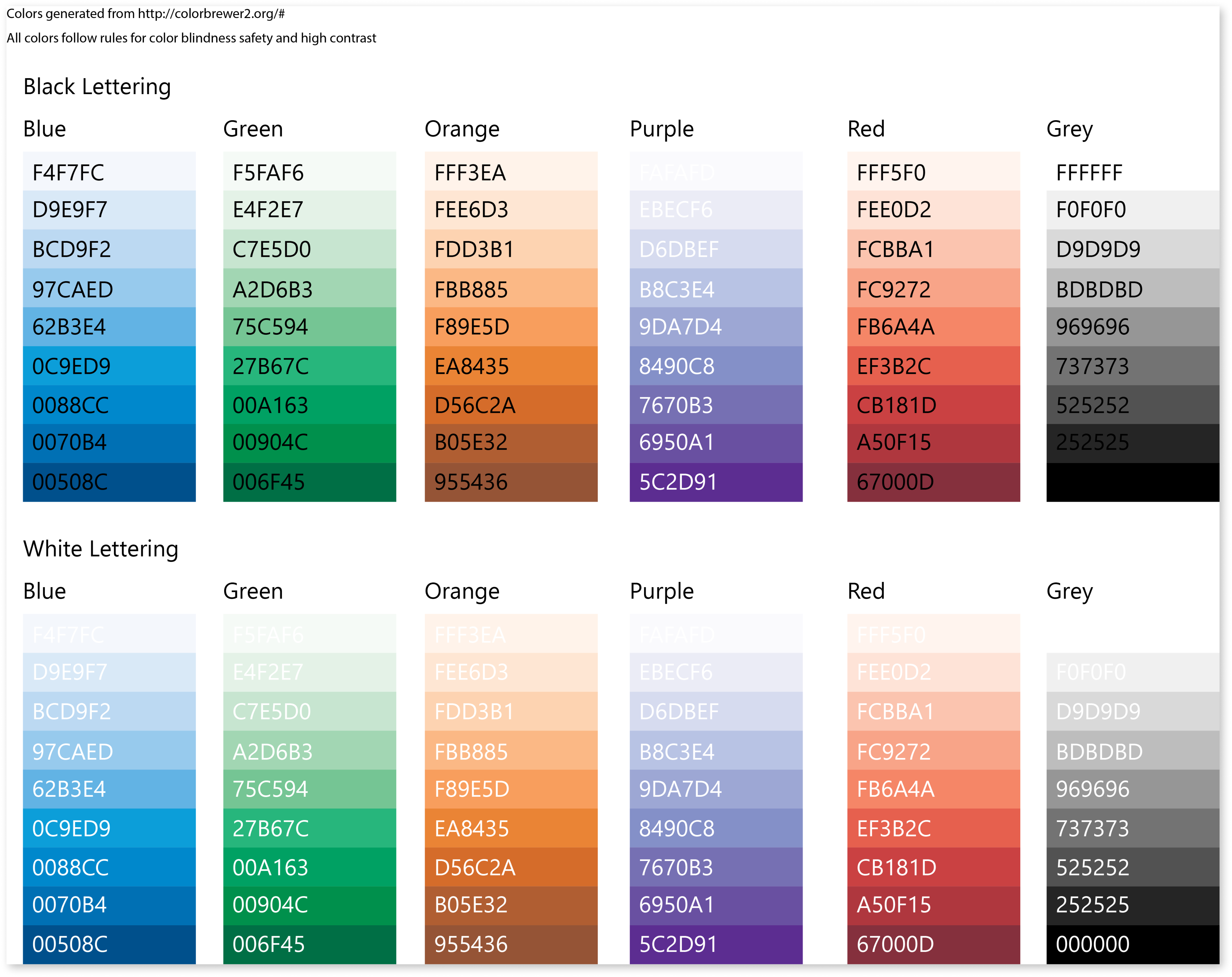
Text on colors
This was the first test of text on a color palette from ColorBrewer 2.0.
The purple did not pass the standards for doing data visualizations, the rest gave me a baseline to work with against existing palettes.
While this would also vary with font choice, the tests were done with Segoe UI.
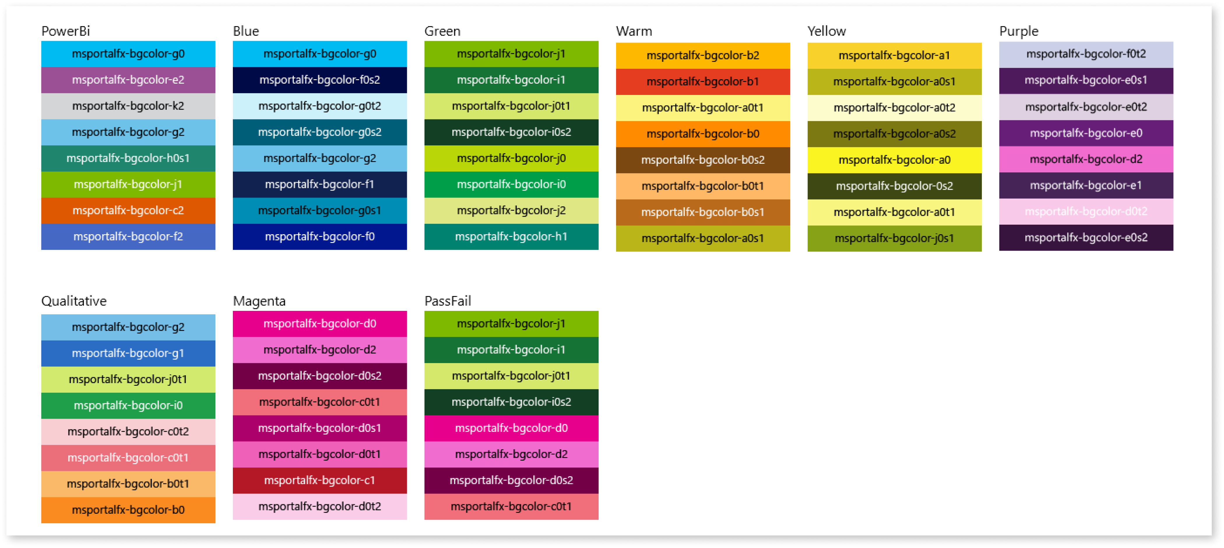
Power BI and Azure palettes
Another data visualization tool, Power Bi had their own palette for data visualization and I started building on that as a foundation.
Application Insights existed in the Azure Portal which had an established color palette that needed to be adhered to.
This palette was the result of combining them together and testing text over the colors for accessibility.
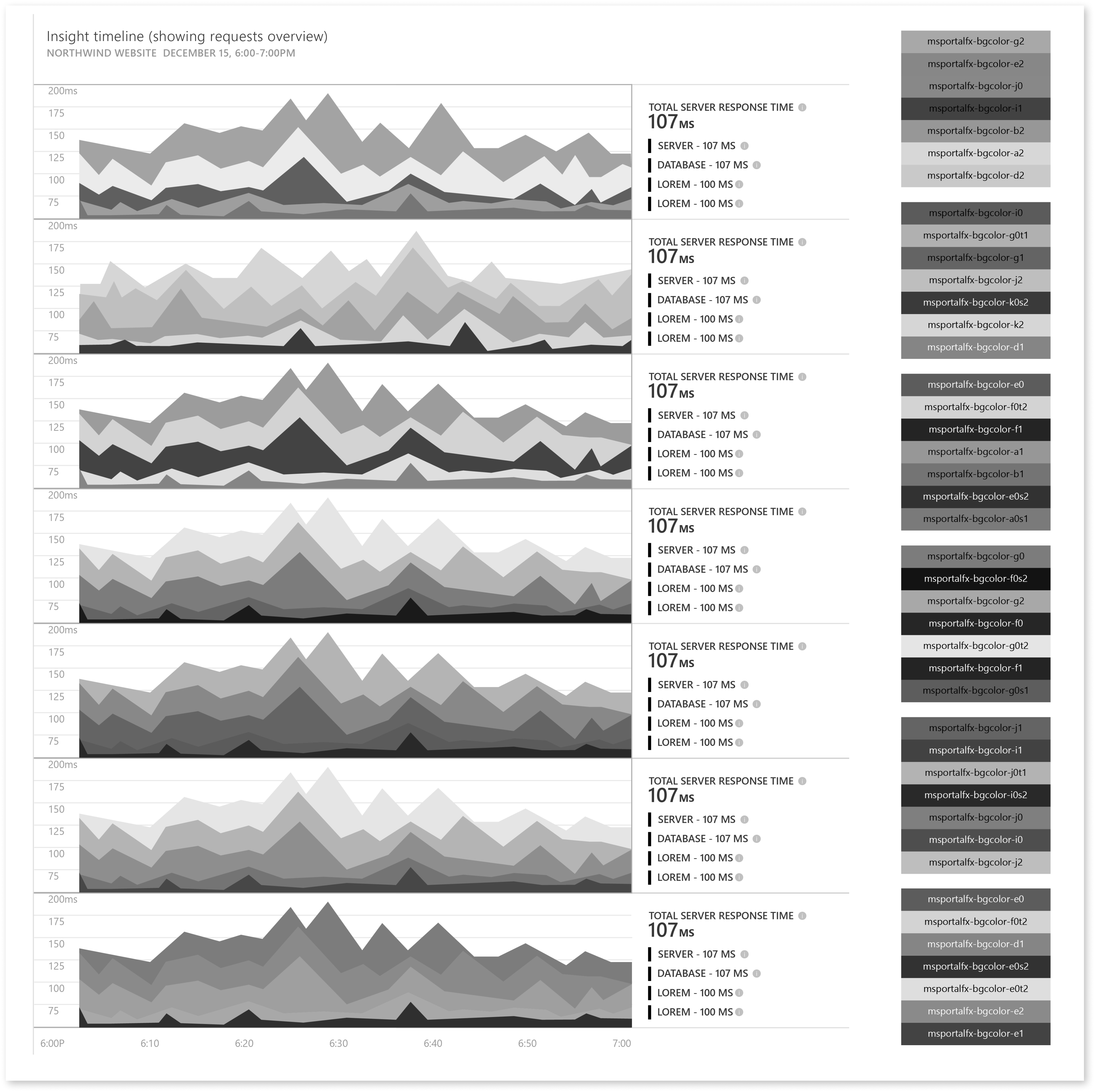
Testing data visualization accessibility
One lesson I learned from working on this was that for any data visualization to be successful, the color palette has to be able to be used in black and white. This is a great way to check color variance and to ensure the palette can convey meaning. Data sets should be able to be cleanly visible from each other to enhance pattern matching and empower the user to make comparisons.
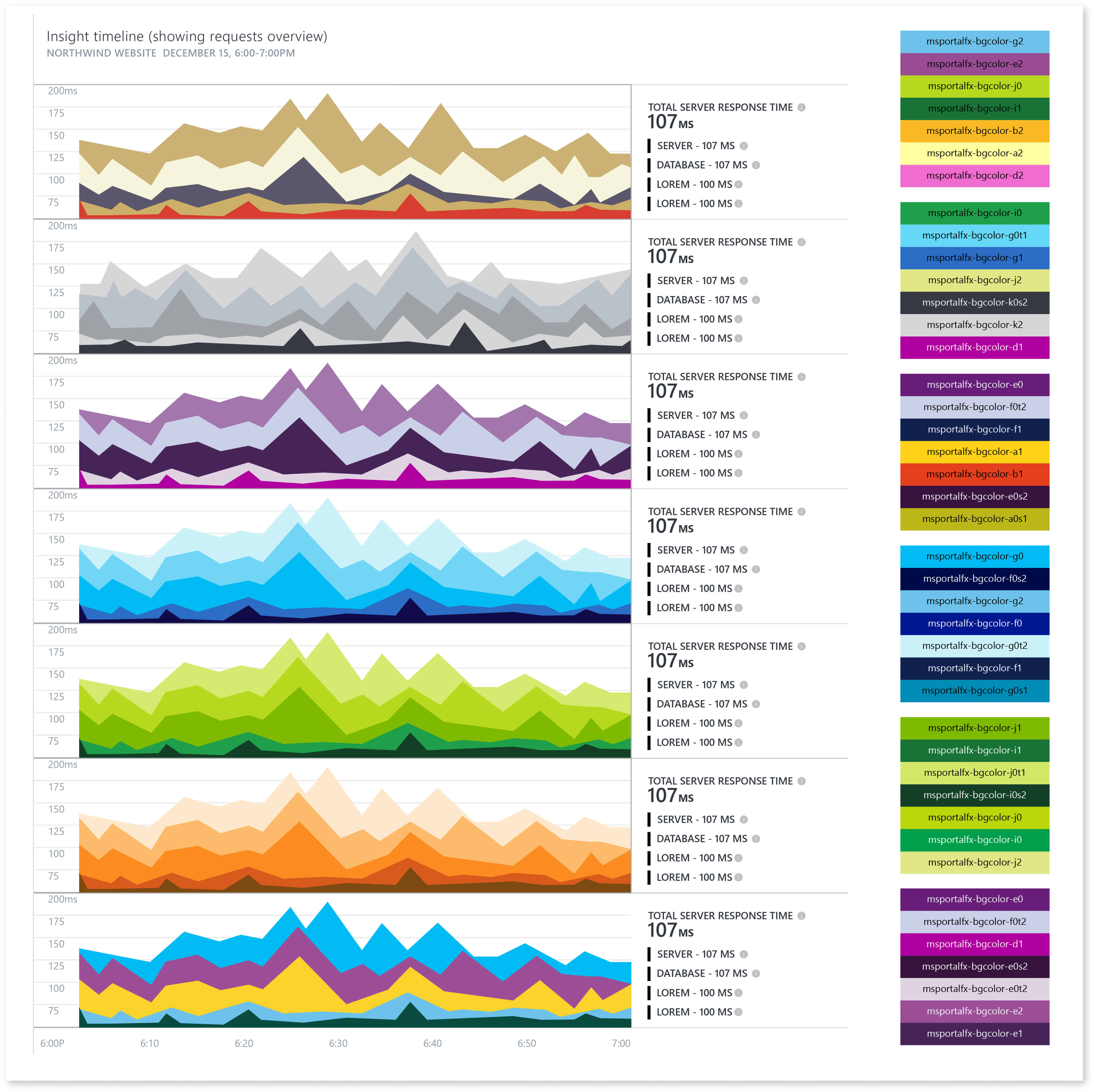
The Monster
There was one major issue with this, we would never have exact control over the color order being generated for a data visualization. Hard coding the colors per data visualization would possibly result in many visualizations having the same palette on a given screen. This would be an anti-pattern because similar colors between different visualizations imply that the same data set is being plotted over and over again.
I was going to have to test a mix of all colors and test them against all possible data visualizations we had for Application Insights.
