Feature – ADvENT Data Explorer
My Role – UX Design – UI Design – Data Design – Planning
Problem statement
The Developer Division business group needed a way a identify trends, adoption, and engagement. Each team that handled the data analysis had built their own suite of tools. In order to identify and understand the way people were interacting with the products from Developer Division it was a necessity to wade through these tools in order to get a complete picture of how the division was doing.
Before I started working on the problem, they had used a number of other tools to unify this; Excel, Power Bi, and other third party tooling. I was tasked with unifying the tooling into a fit-to-purpose analytics package.
*All data in this case study is fake and for illustration purposes only. It is not indicative of real world information in any way. Interfaces have been left out or heavily changed, but retain the design look and feel, that are not necessary to tell the story.
What did the tool landscape look like?
The different groups responsible for managing, monitoring, and deploying the software products of Developer Division each had their own tools for tracking their data. This is not that unusual in enterprise scale software companies as the needs and tracking data is different for each product. The first thing to do was identify what we wanted to accomplish from each piece of software.
Interviewing users
Members of the main data analytics team, General Managers, and the leadership of Developer Division were the users. I conducted 20 interviews in the first weeks with people from all levels of the three groups. Some of the questions I had users voice to me were:
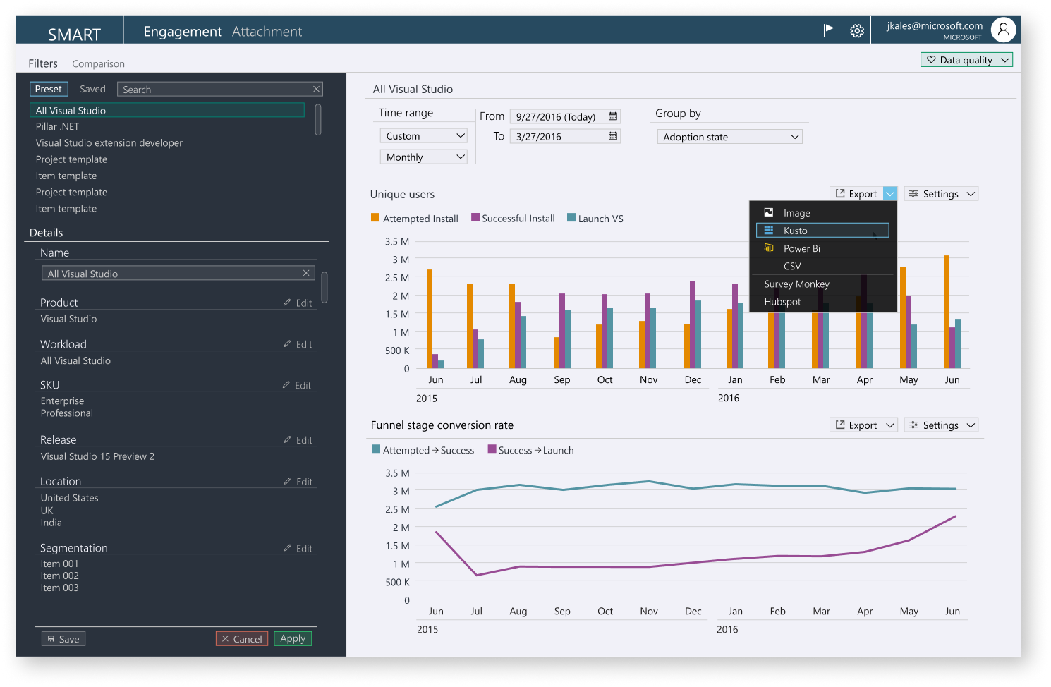
– How many active and engaged users we have for a project type or cohort?
– What are the engagement levels of net new users?
– Are we getting net new installs to VS and to a particular workload?
– How is the install experience per workload, how does it compare to other workloads?
From these and more, we put together four goals we wanted to accomplish:
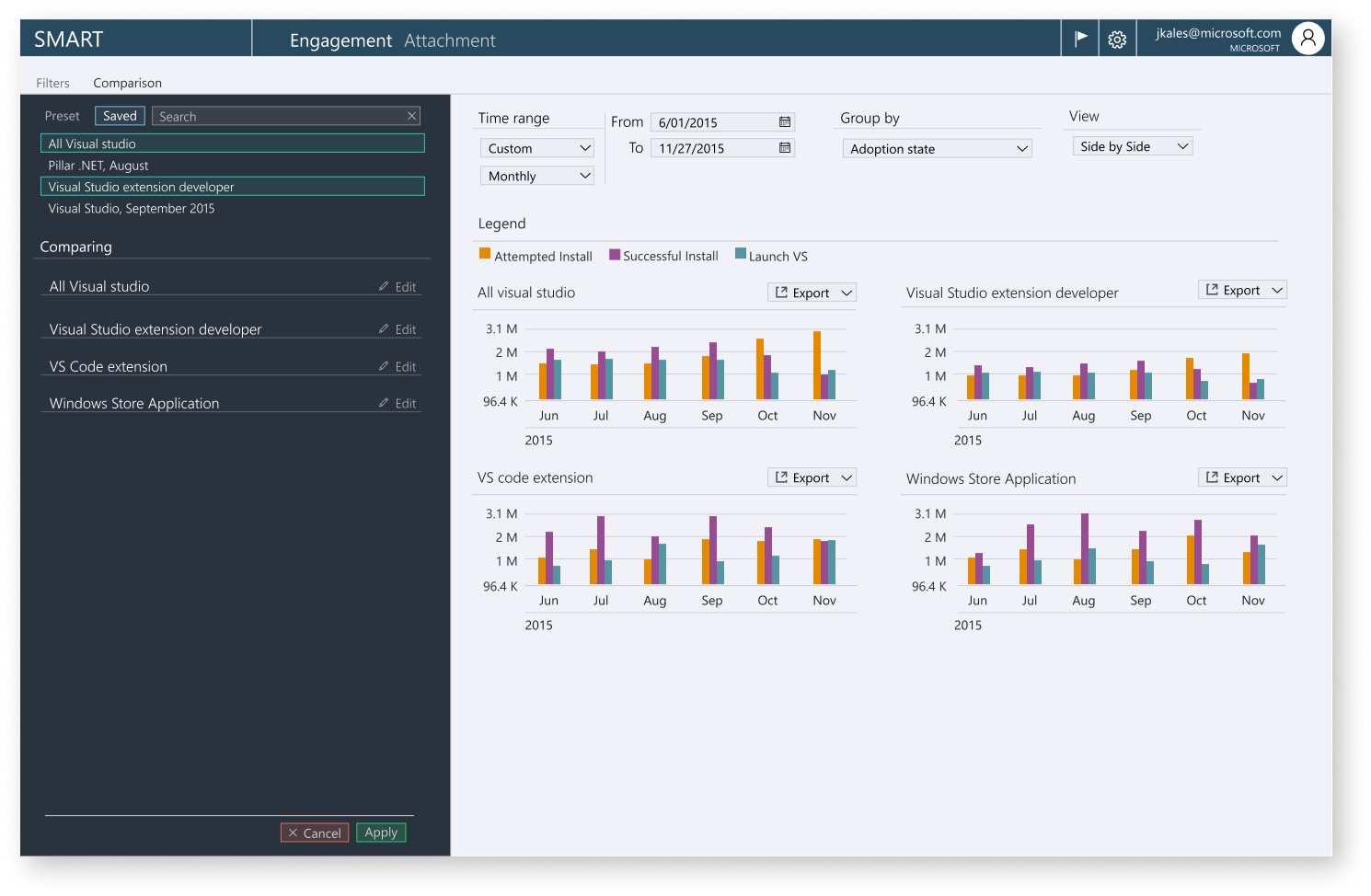
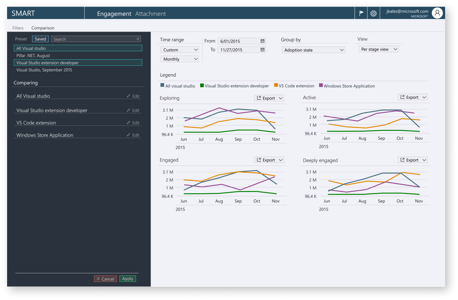
Unified way of calculating adoption and engagement to enable comparison
Unified views to browse through various workloads
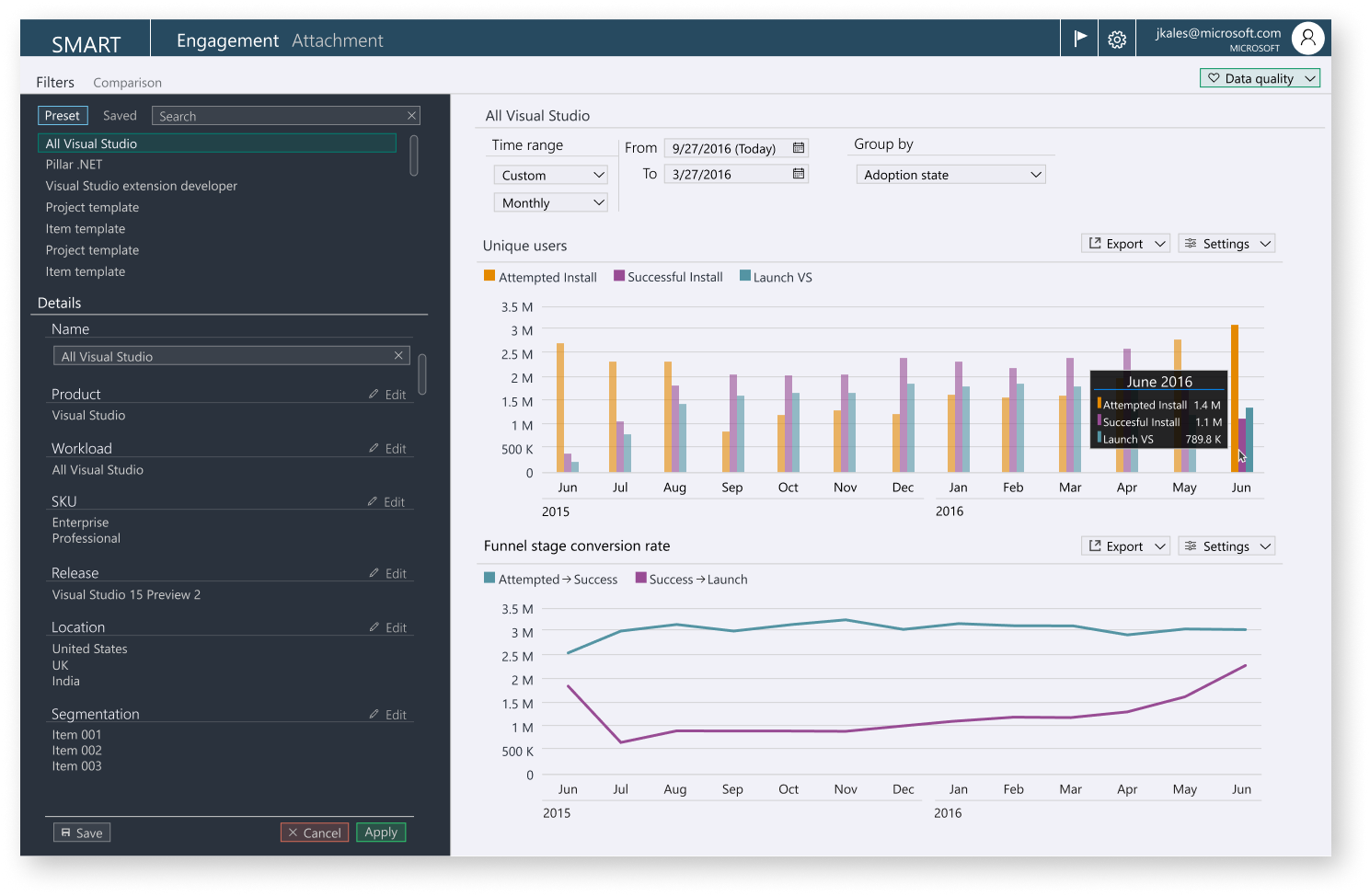
Easy querying interface to help drill down deeper
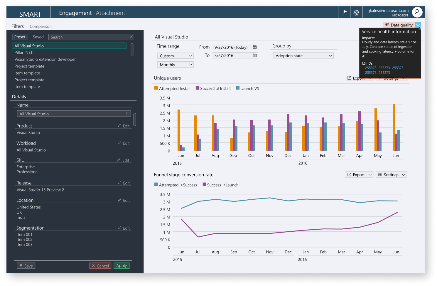
Ability to surface data issues in the pipeline or right in the app
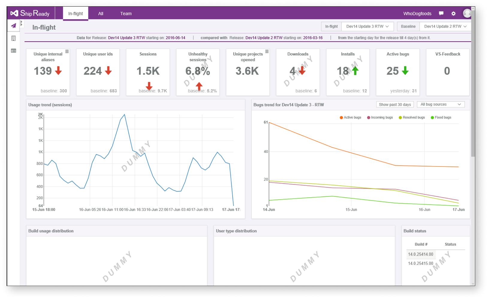
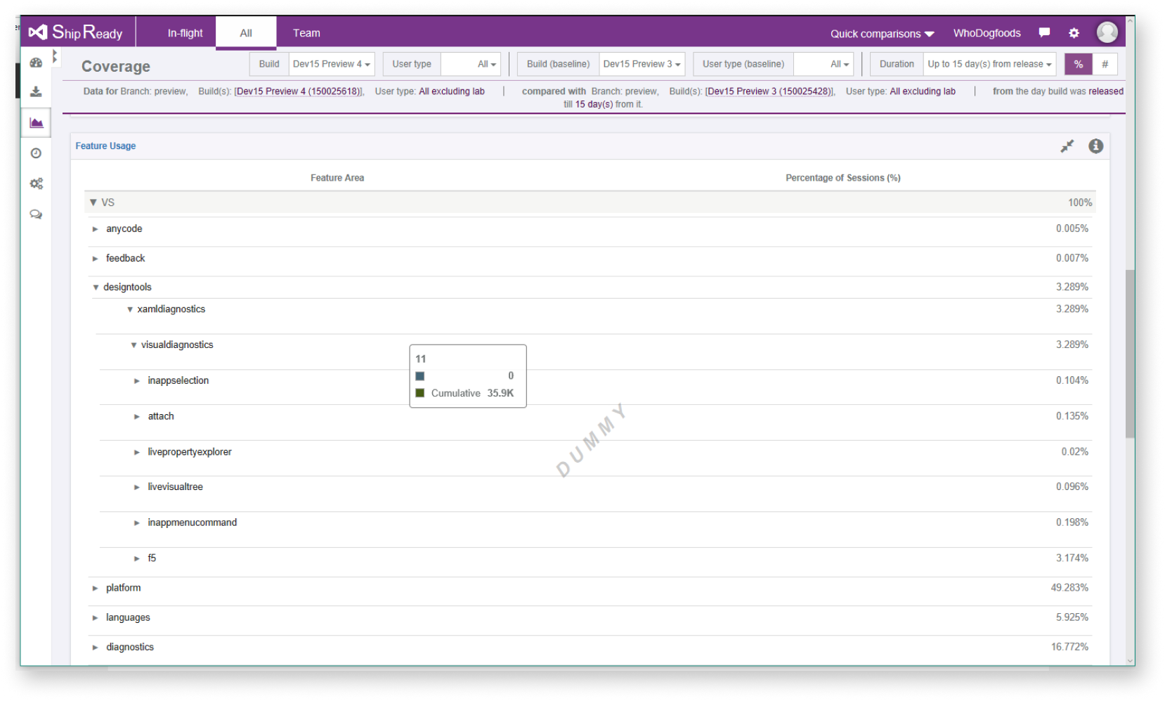
The application landscape
We had three applications we needed to merge together; VS TelHealth, ShipReady, and the FeatureDash.
(data omitted)
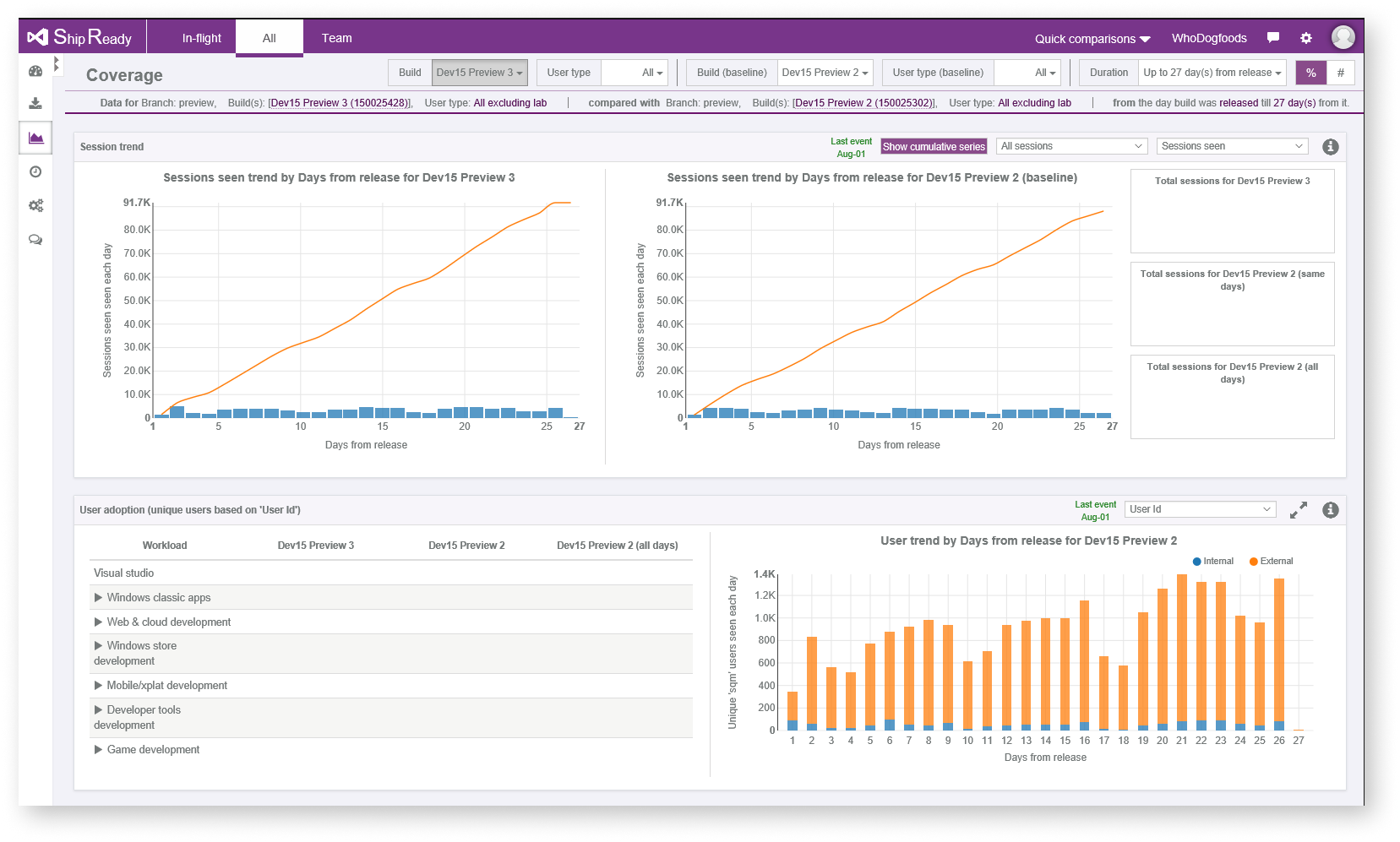
What aspects of these applications are we taking
The two applications were some of the most used in obtaining data and there were common experiences they had that users identified they wanted, from interviews.
– Easy monitoring
– Data confidence
– Data availability
– Forming an executive summary
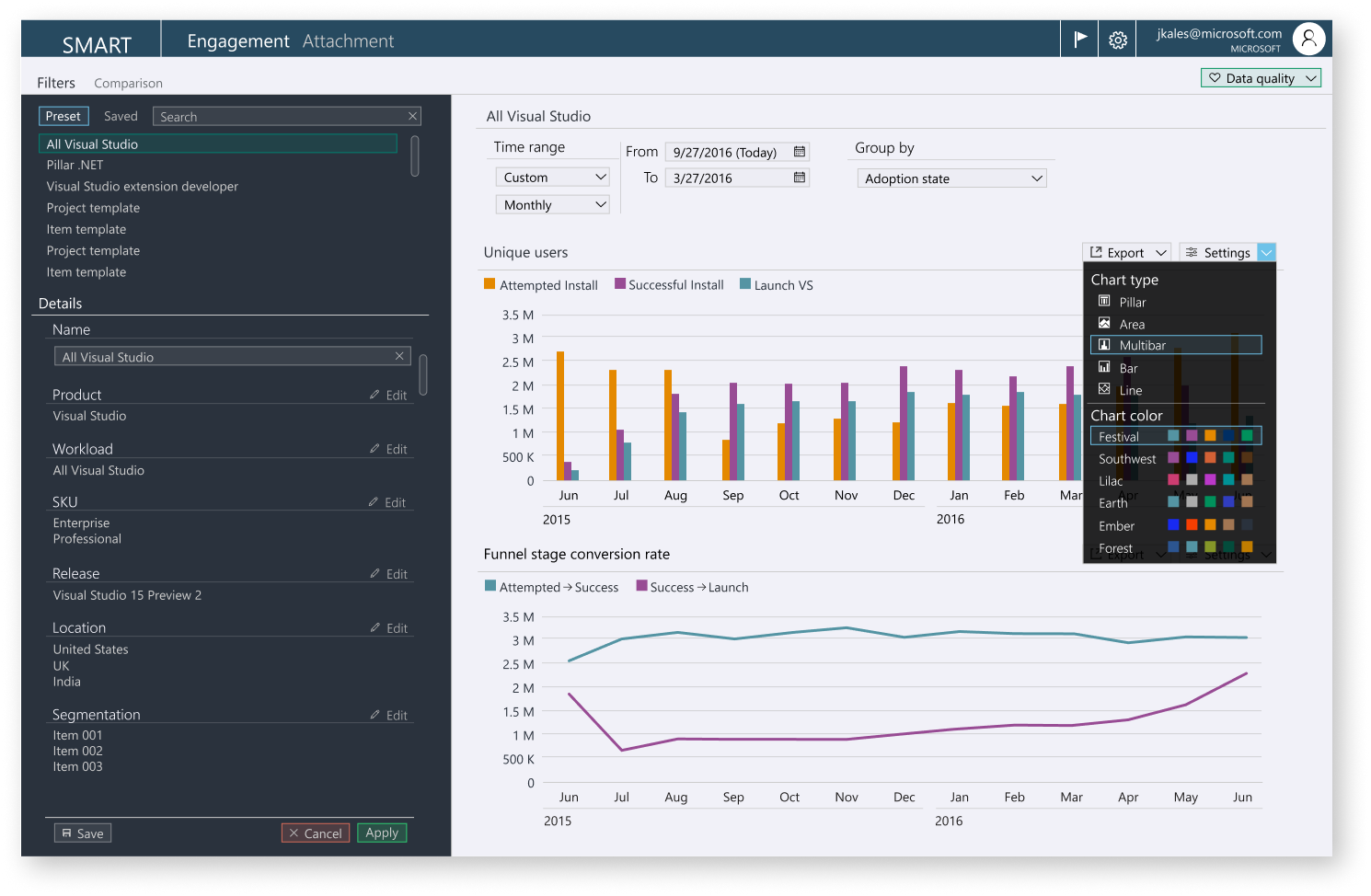
– Ability to drill into data
Wireframes done quick, by users
I made a way for users to put together parts and pieces in power point; like digital paper prototyping. I then took all the screens and put together the most used workflows and features, it was really based on the highest occurrence of similar ideas.
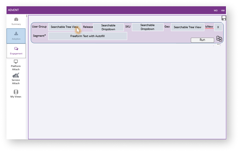
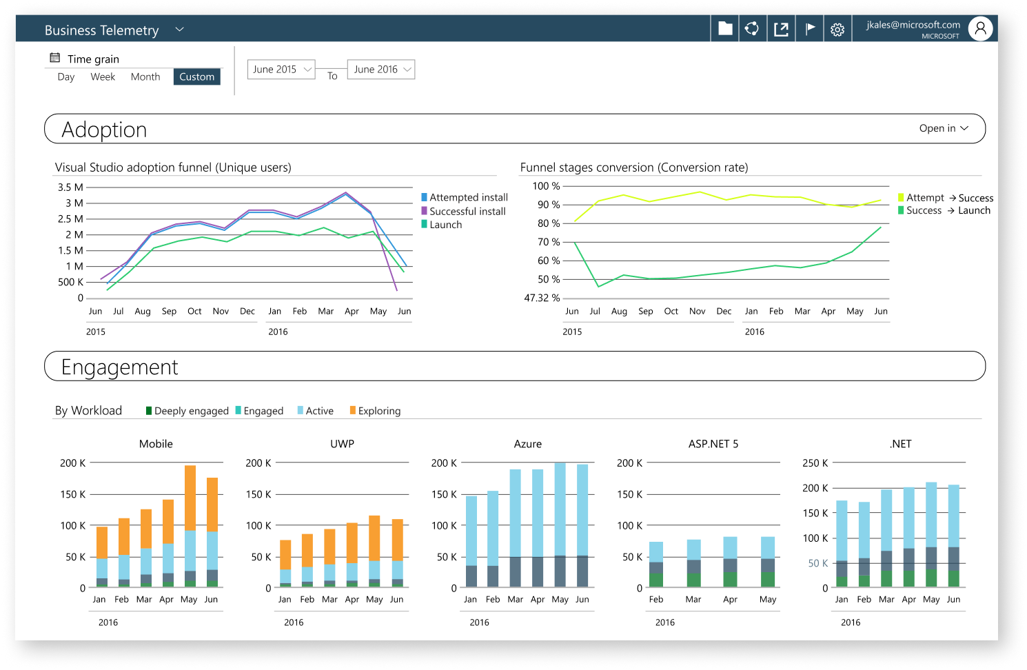
Starting on design
Adoption, Engagement, and social data were three different teams. The plan was to have a unified design system that was modular and would enable the three teams to code at their own pace and ability.
The other applications were built in three different languages and design systems. Since this would be unified, the faster teams would be able to load controls into a unified library for the other teams to bootstrap their way forward.
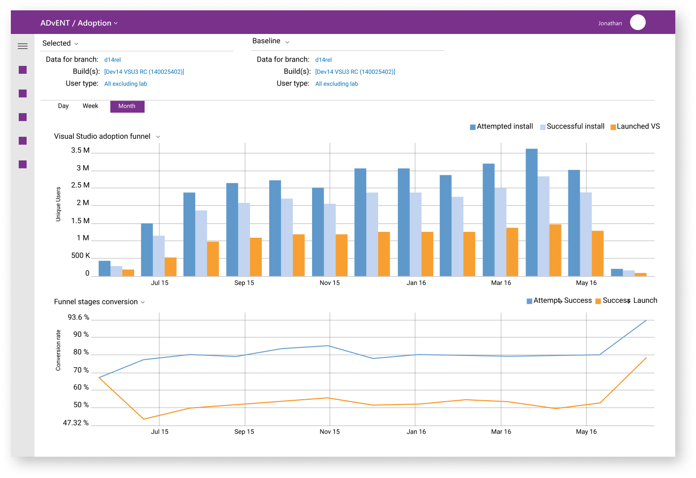
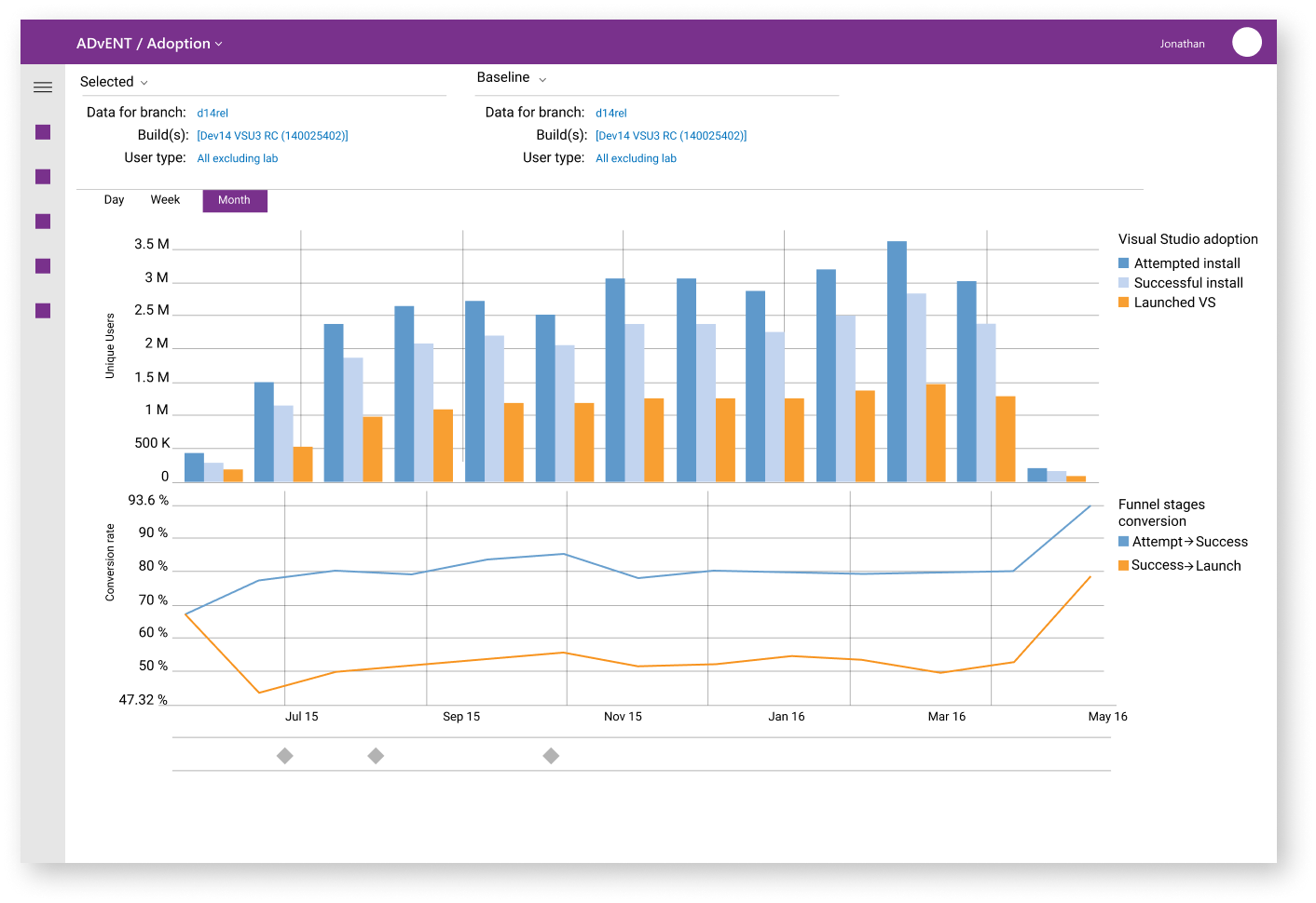
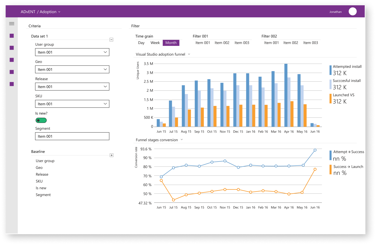
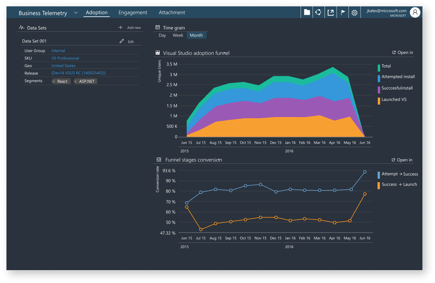
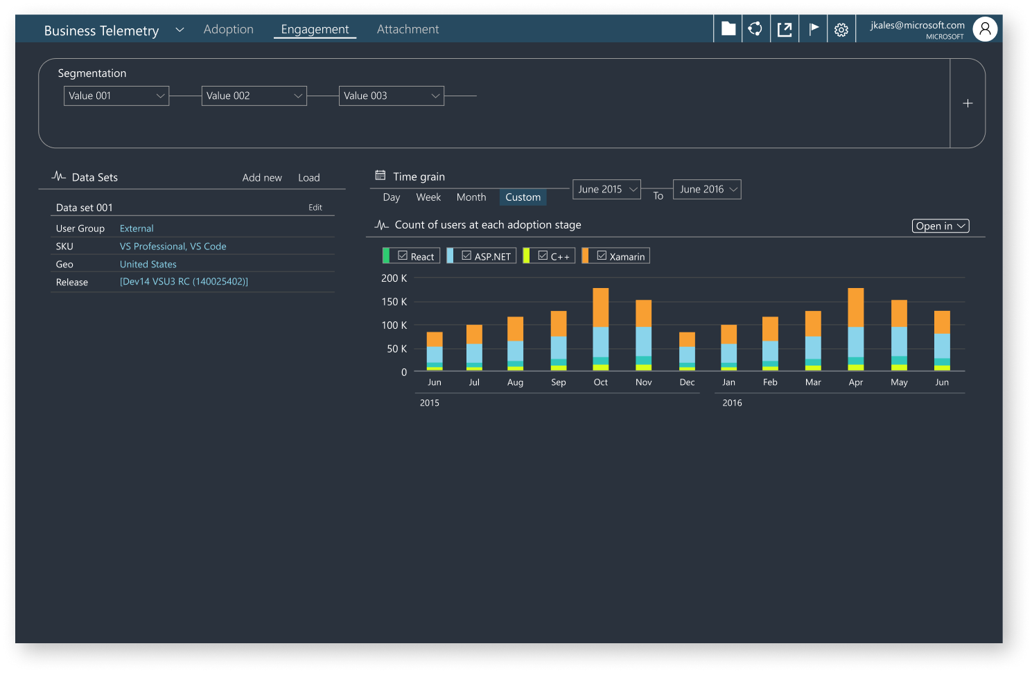
Version 001
Exploring layouts of companion data sets
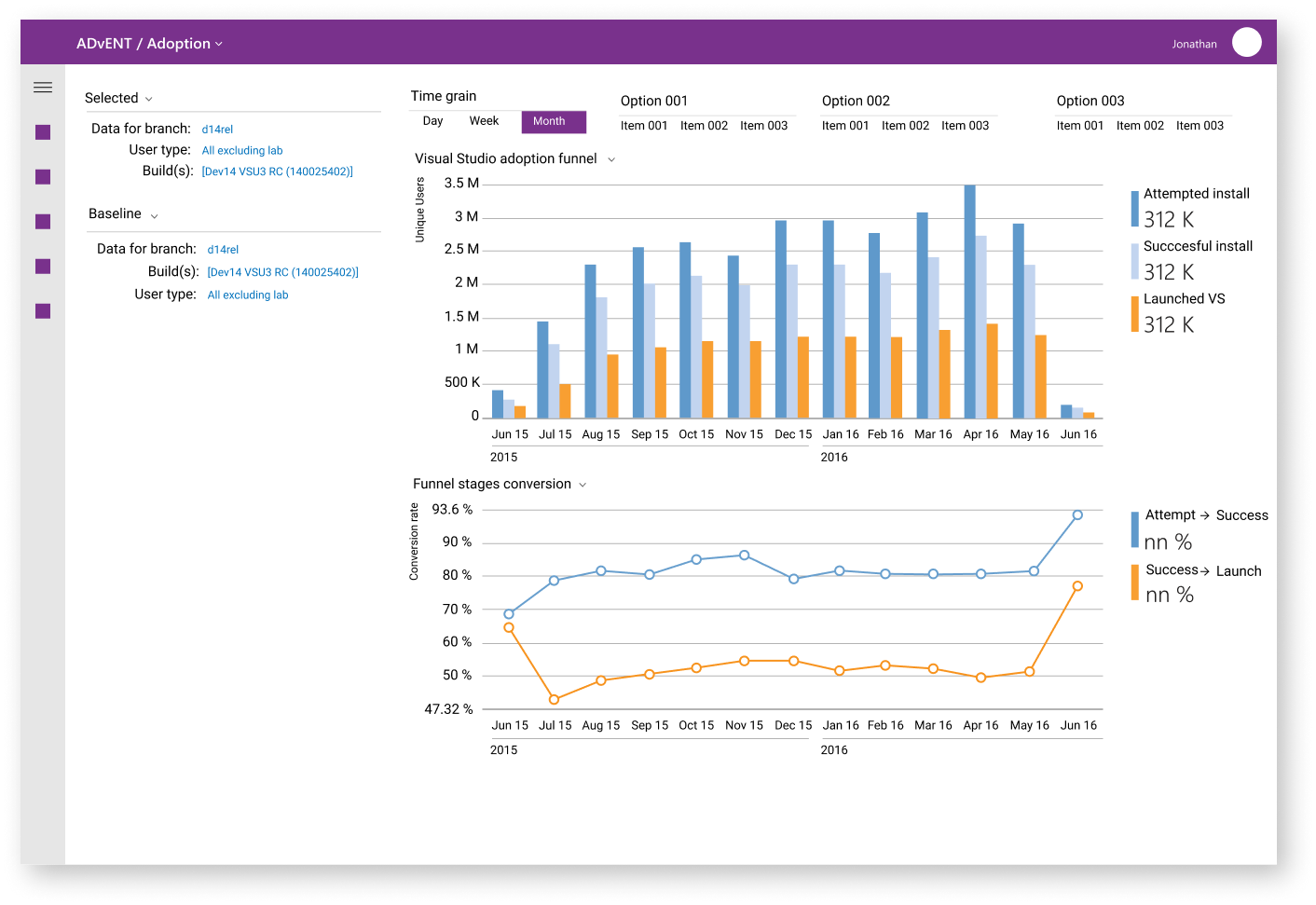
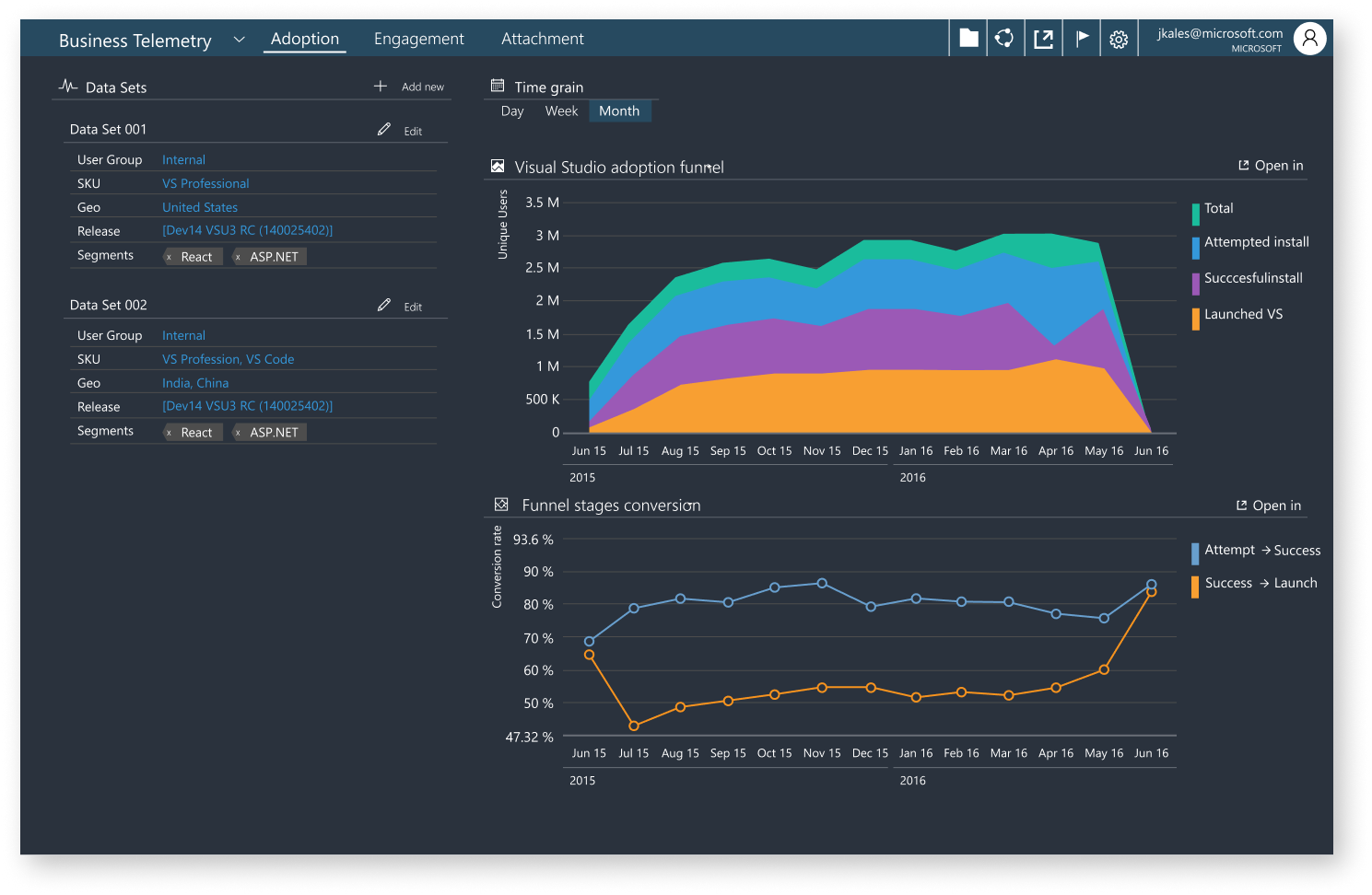
Version 002
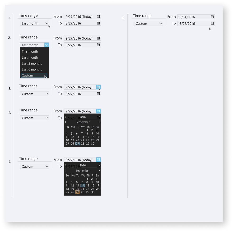
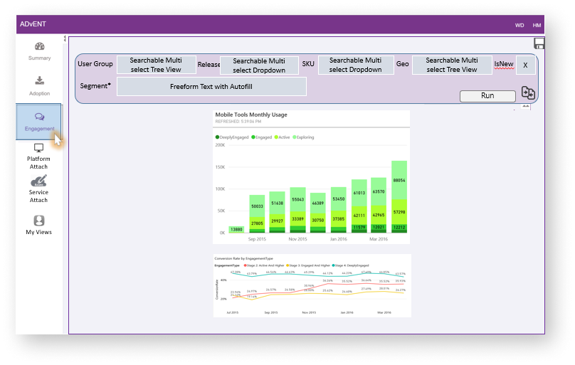
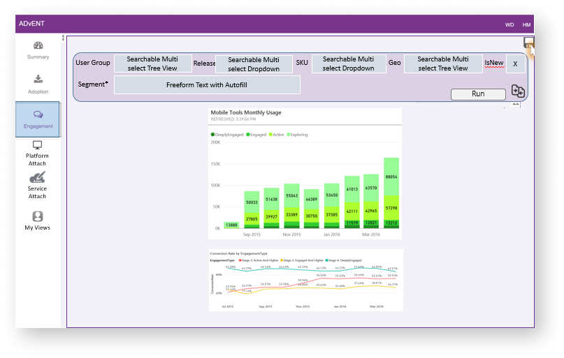
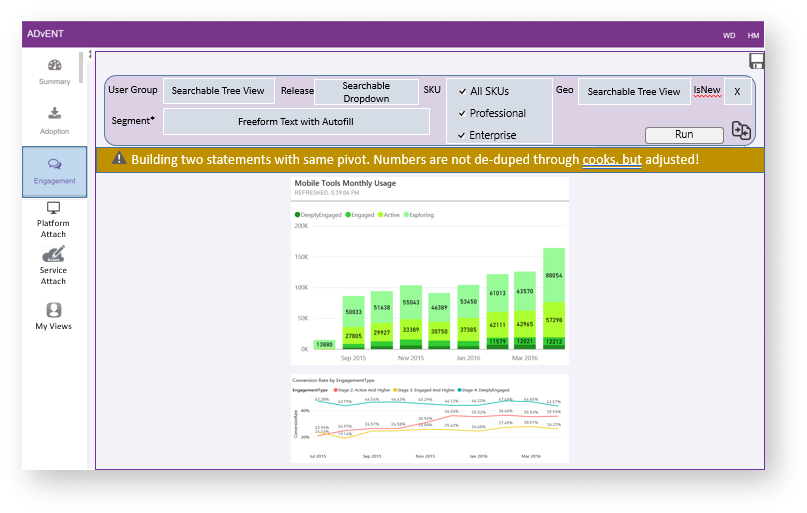
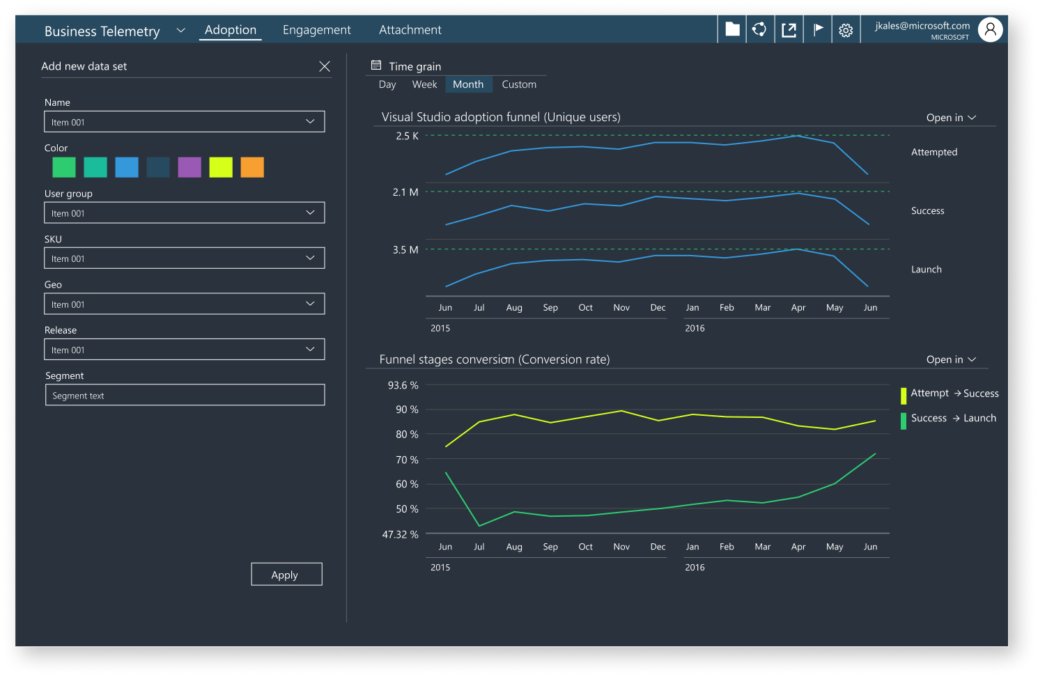
Adding a query system to build custom data sets
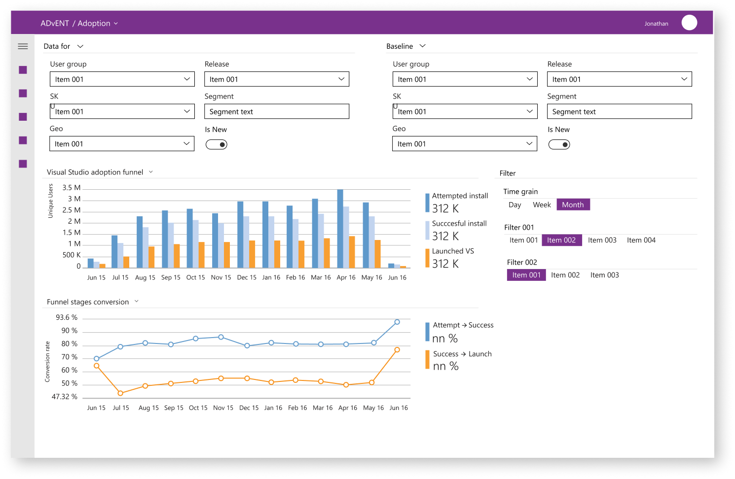
for vertical master / detail
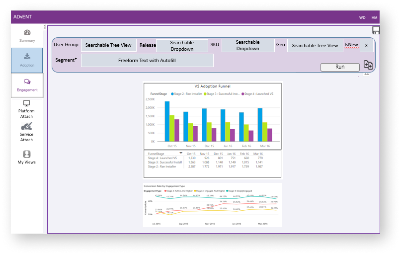
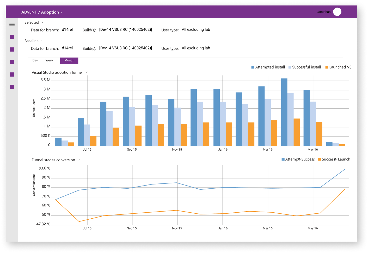
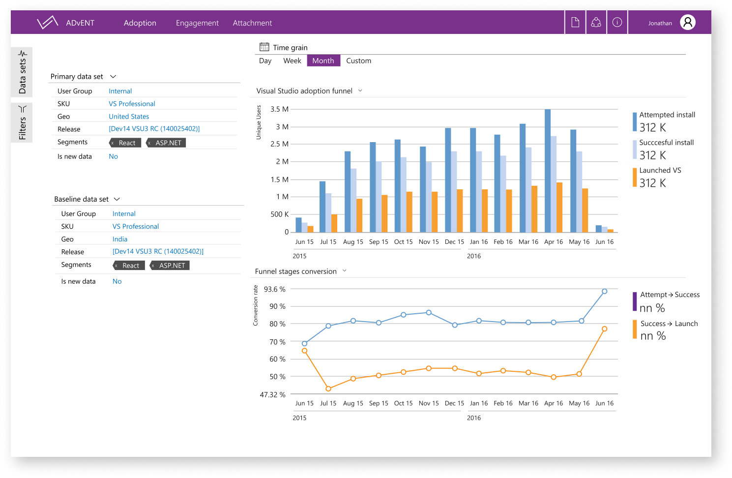
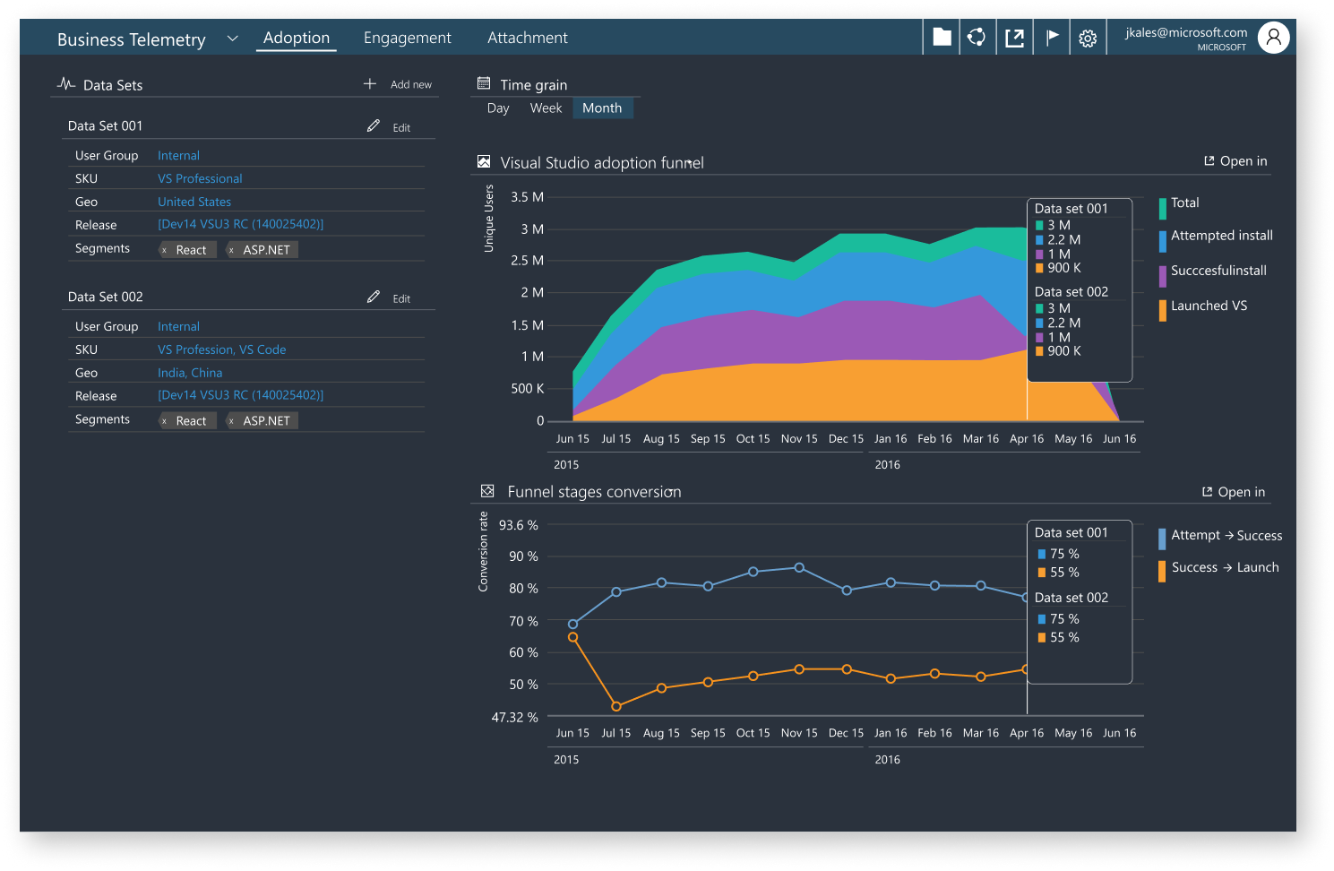
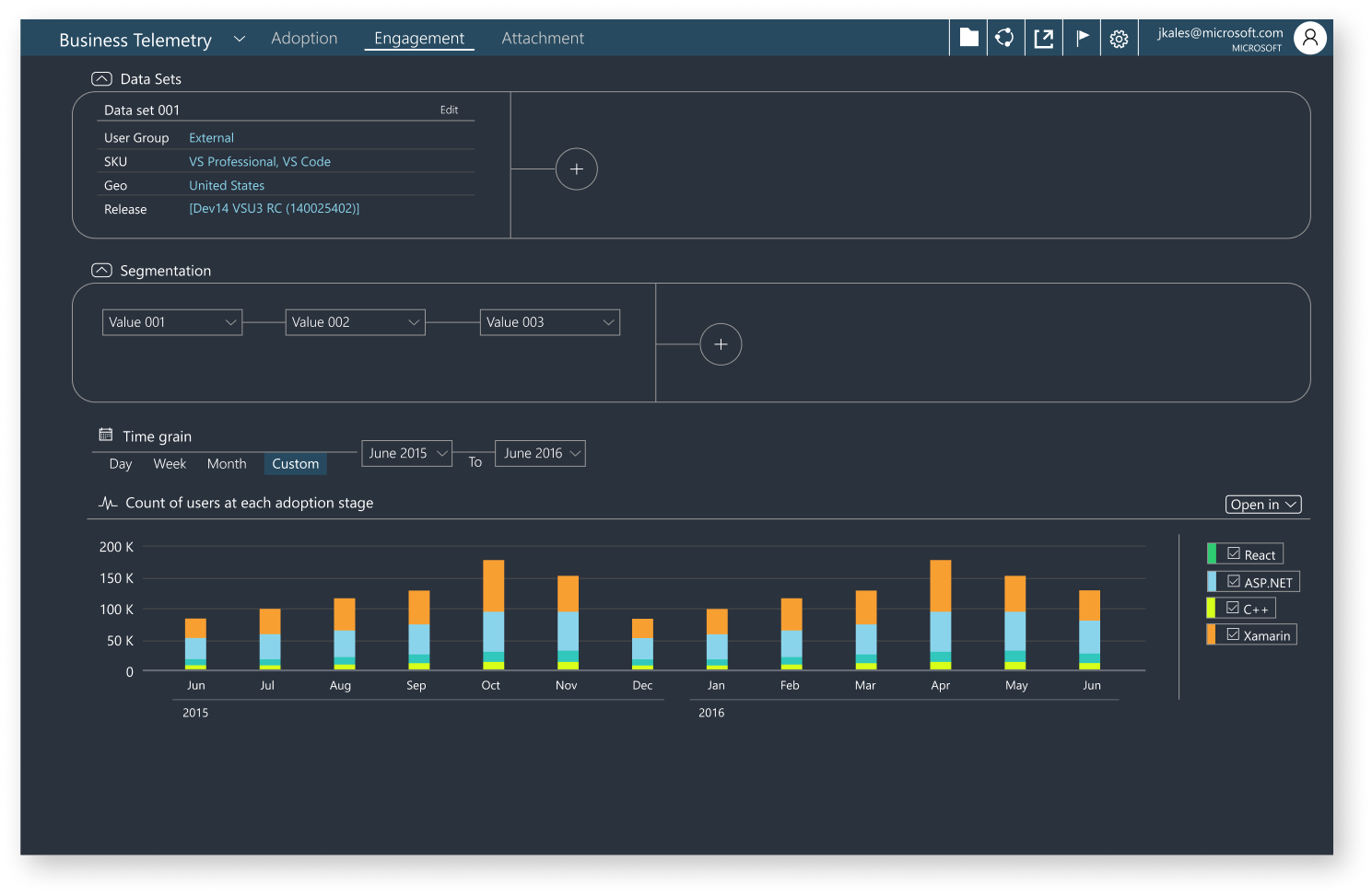
Version 003
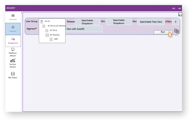
Data set options are favored on the left, what happens if we go dark
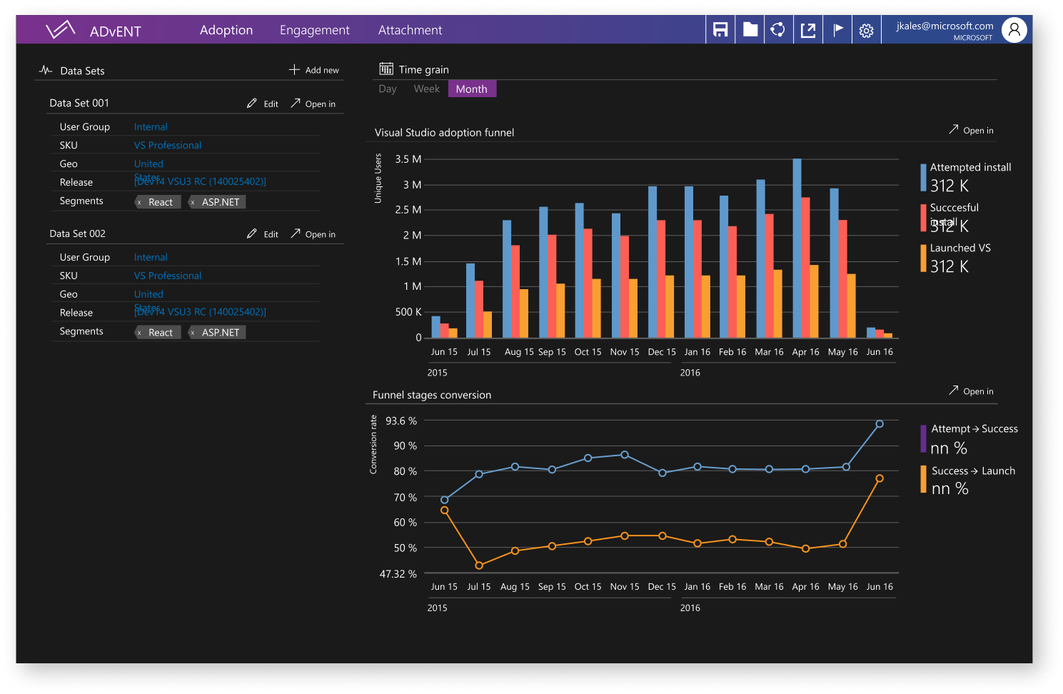
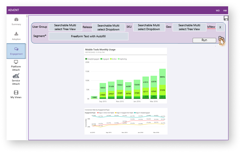
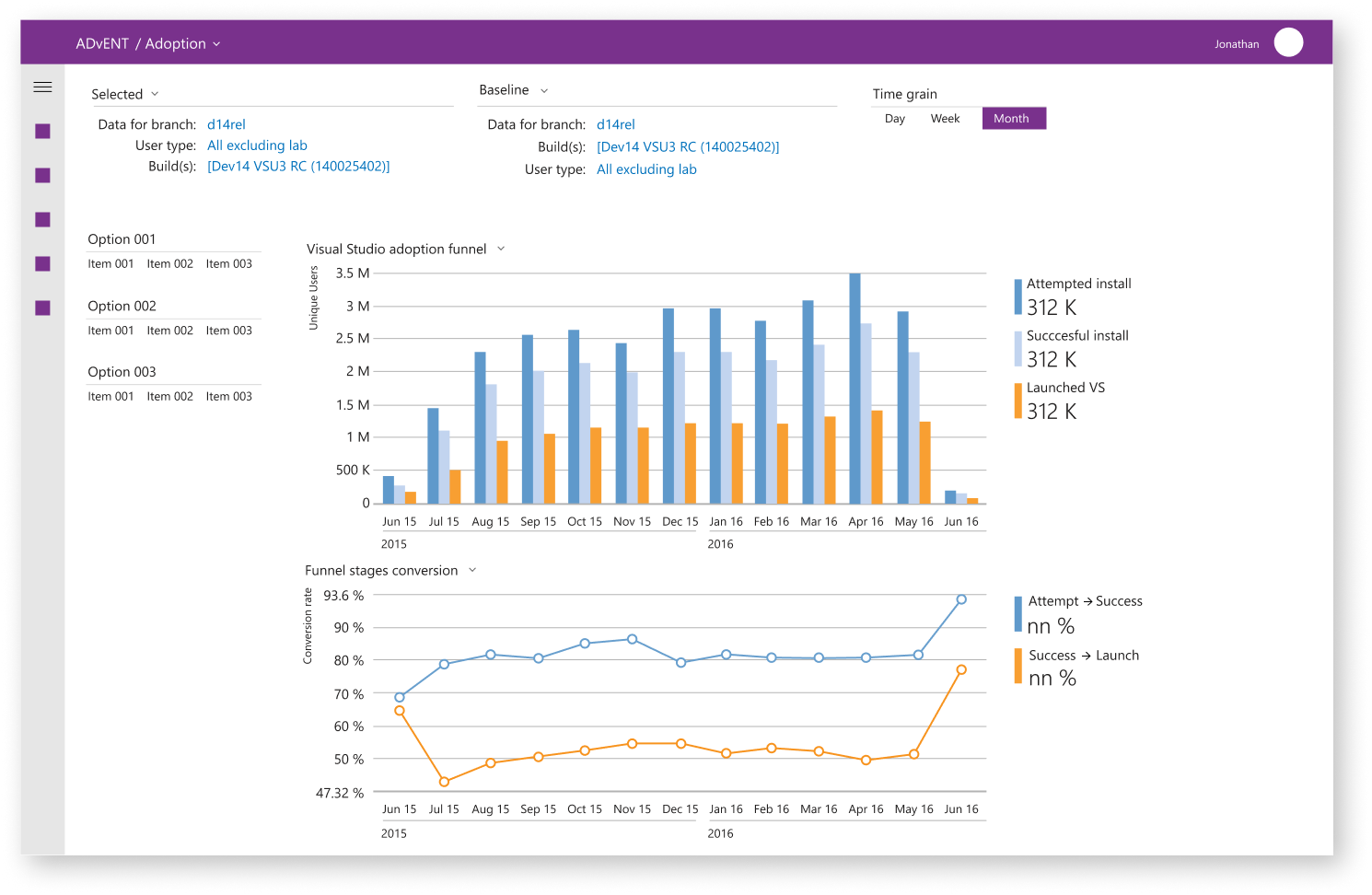
Version 004
Adding a data set

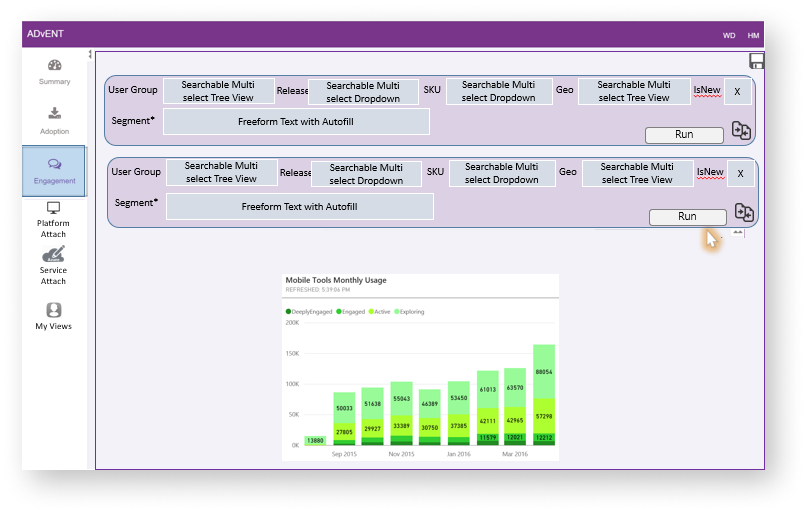
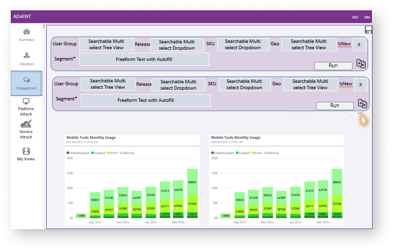
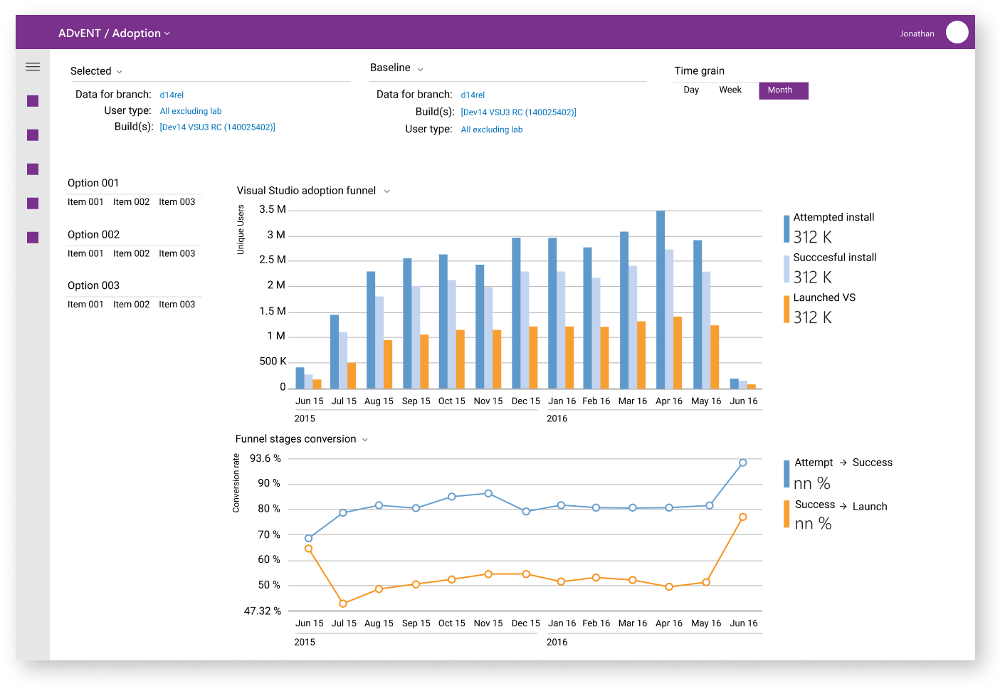
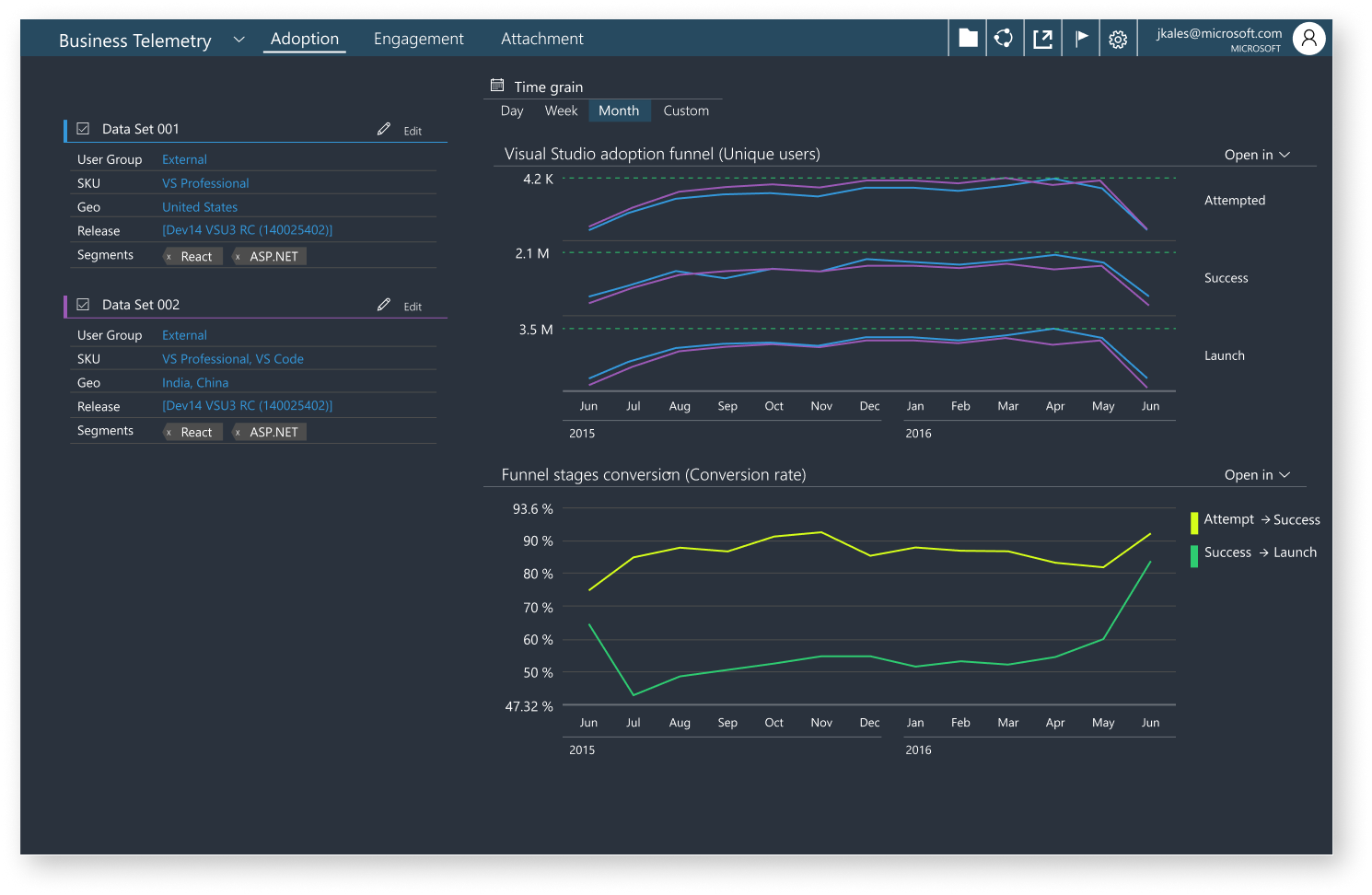
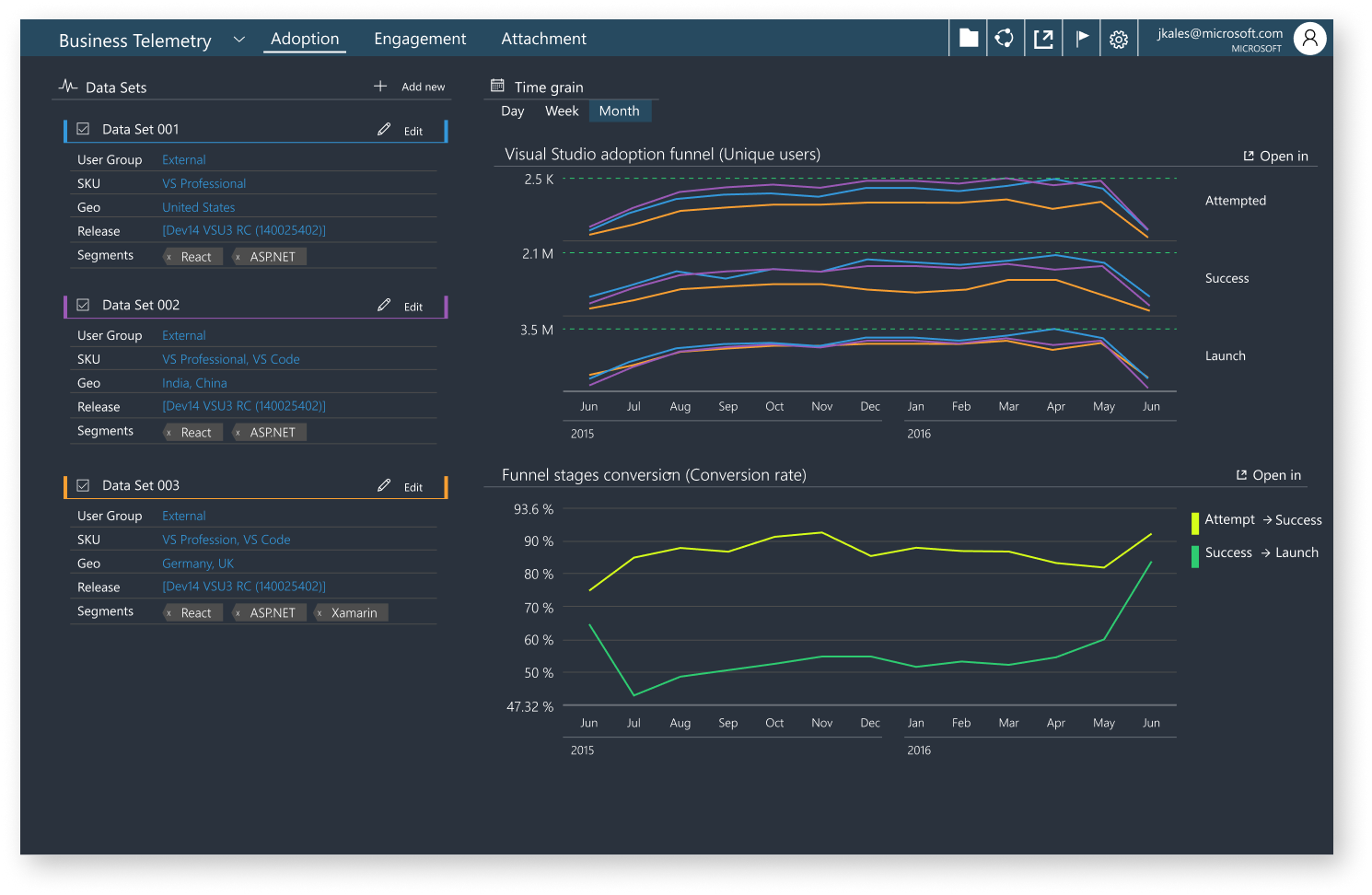
Version 005
Adding a second and third data set
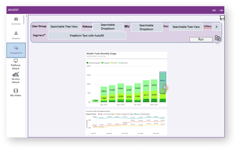
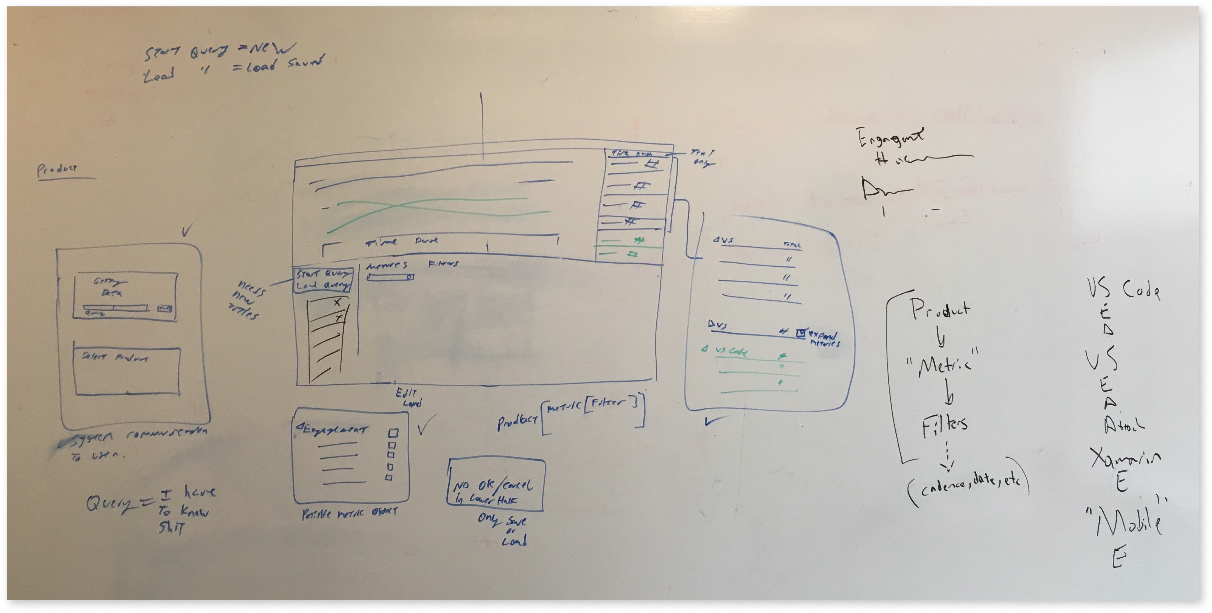
Side exploration
Looking at different models of querying the data
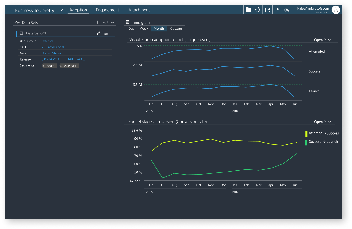
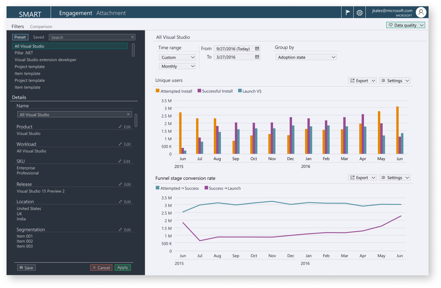
Version 006
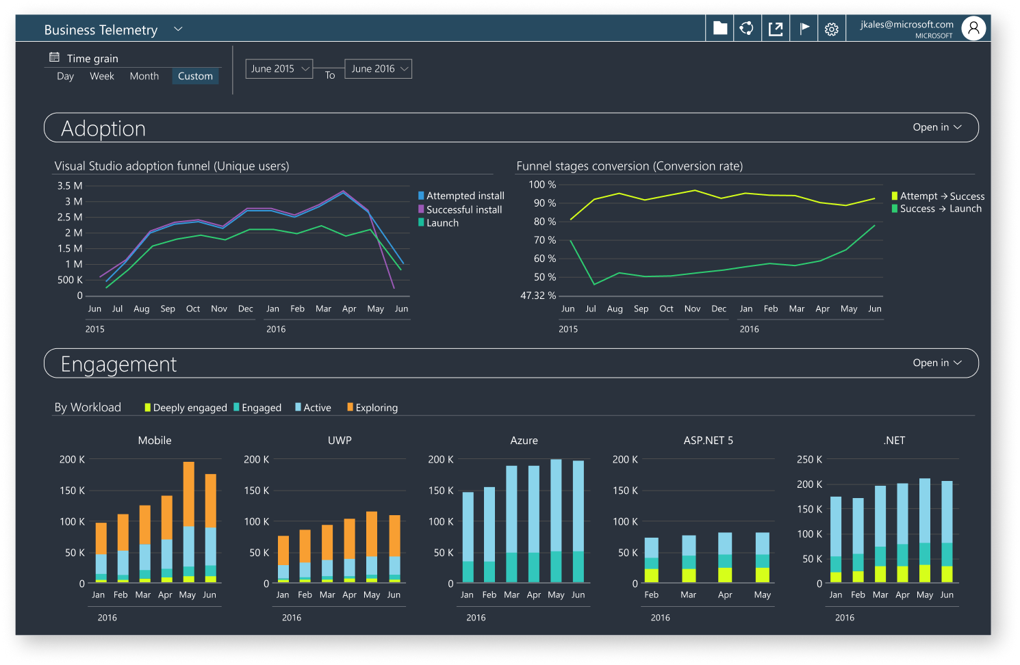
Finishing up other interactions patterns and the return to an off-light palette
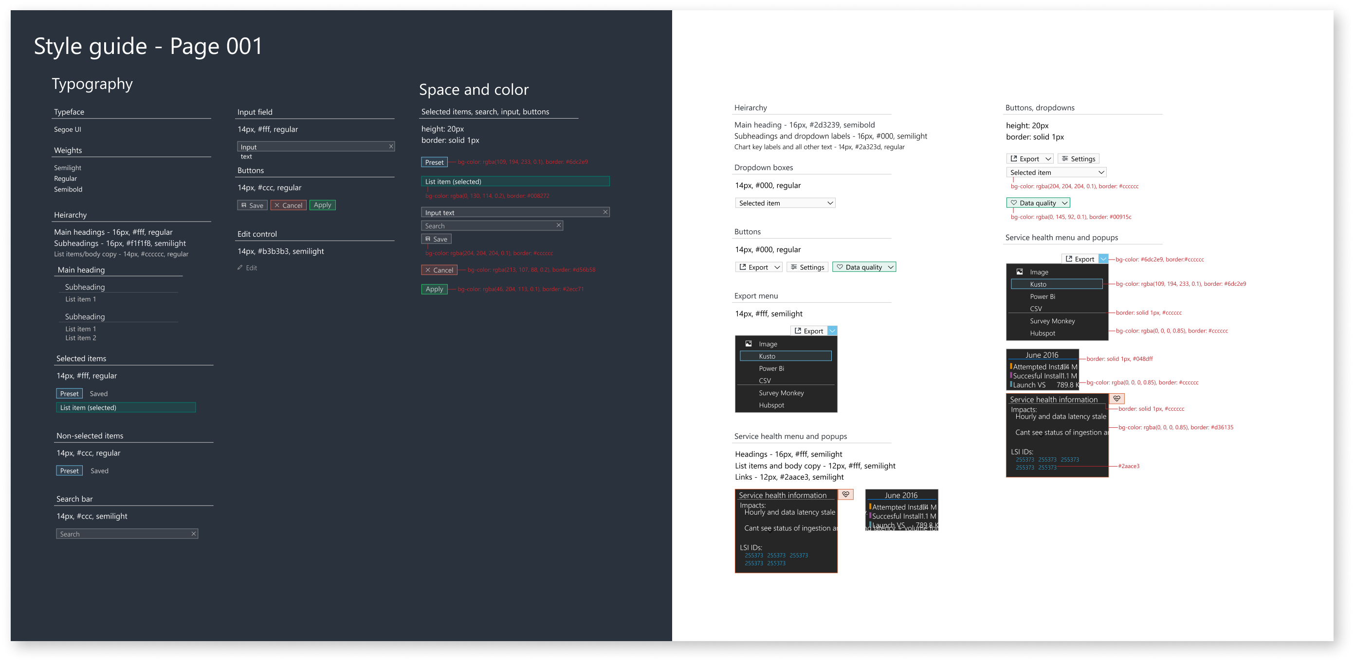
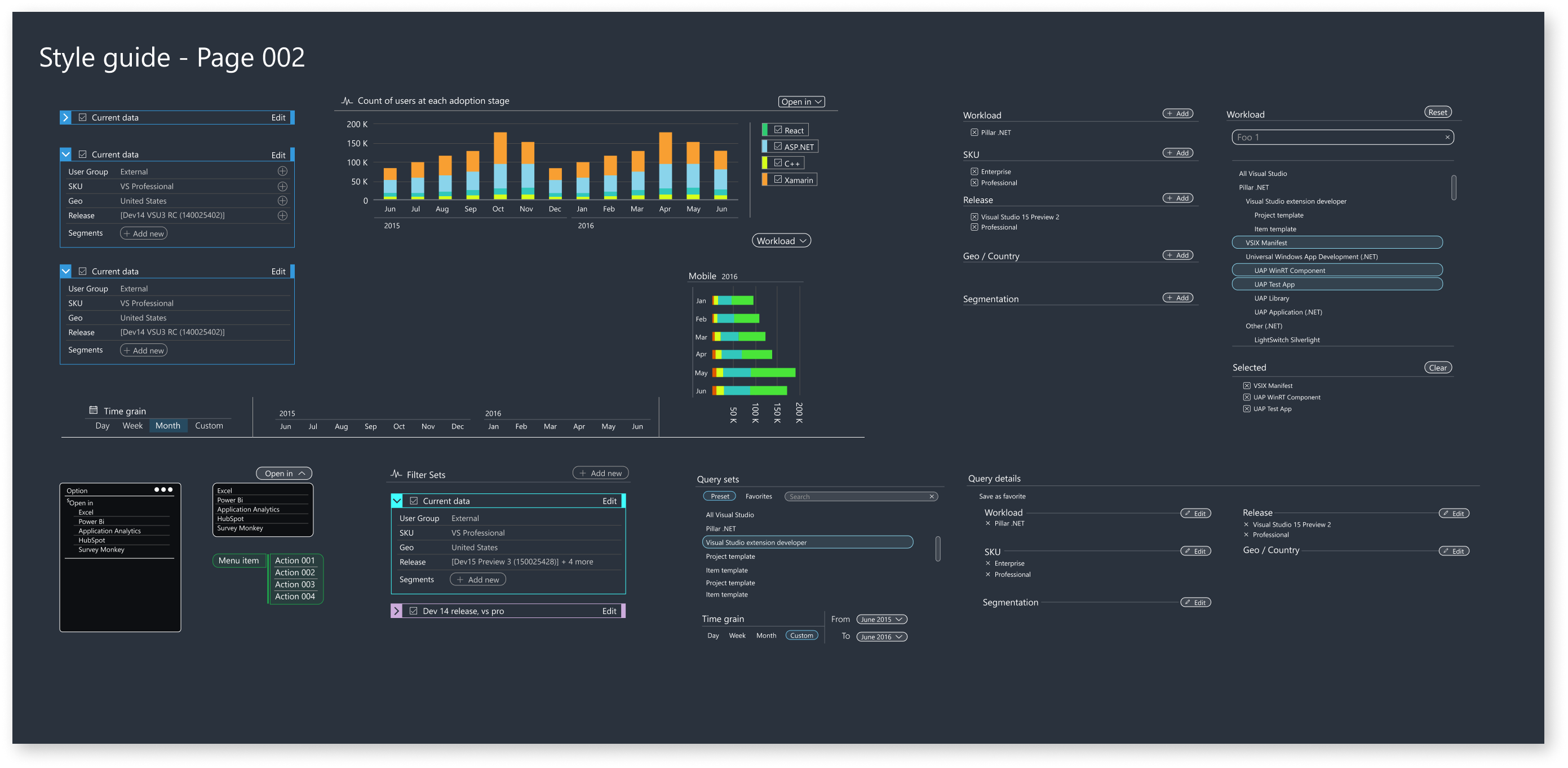
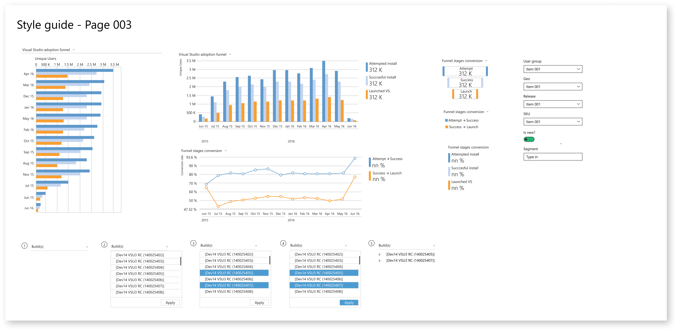
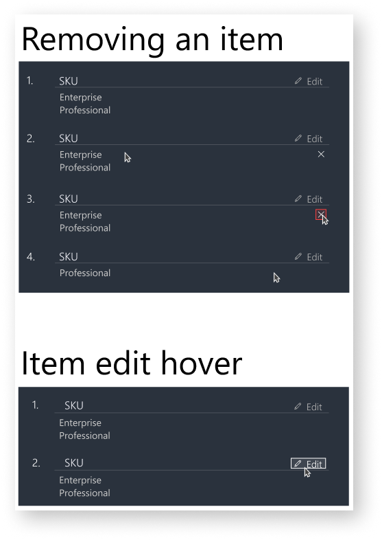
Style guides and patterns