Feature – Metrics
My Role – UX Design – UI Design – Data Design
Problem statement
HockeyApp mobile was the first to get data visualization for on the go quick information. I wanted to make the web application more robust to match this. Building on the work from Application Insights and Intellitrace, I was prepared to apply that research to the way a user would navigate trends, logs, and application performance.
Data visualization in HockeyApp
Round charts vs bar charts
Pie charts, ring charts, car type gauges present data in a format for a mobile experience with advantages:
– Data can be in a compact format, useful on a small screen.
– Easy to spot check when there are few data sets.
The disadvantages can outweigh this
– Data can be exaggerated to fill in the complete circle shape.
– Outlying trends can be hidden by the format due to the exaggeration.
– Because larger shapes attract our eye as humans, the exaggeration can reinforce an incorrect judgement of the data.
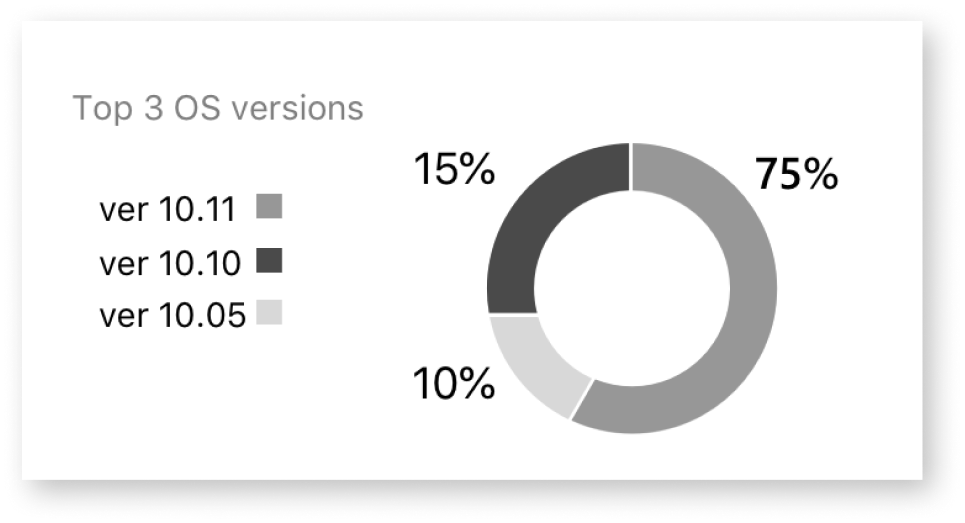
There is a higher cognitive load here to match up the version values on the left with the visualization of the data on the right. As an example of this, it appears that the 15% is almost as big as the 75% section. An incorrect assessment.
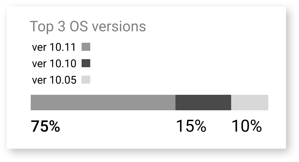
Here in the stacked bar, we can see a more true representation of the data. The 15% is represented with complete accuracy on the bar, as is the 10%. It is also easier to match up the legend values to the bar.
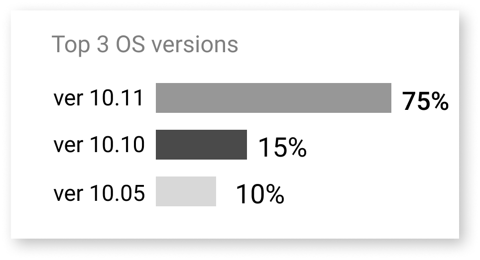
Splitting the bars allows the legend to be directly next to the data values. The 15% is again correctly represented against the other values.
I tested this with 20 users who do software development for their companies. I reviewed this with users in our slack channels. This allowed me to have a virtual focus group able to express their opinions directly into the channel.
– Nearly all users found the round chart to be appealing.
– All 20 users found the split bars to be the fastest way to find out what version was crashing the most.
– Being able to have a clear view into a metric was most important.
HockeyApp Metrics
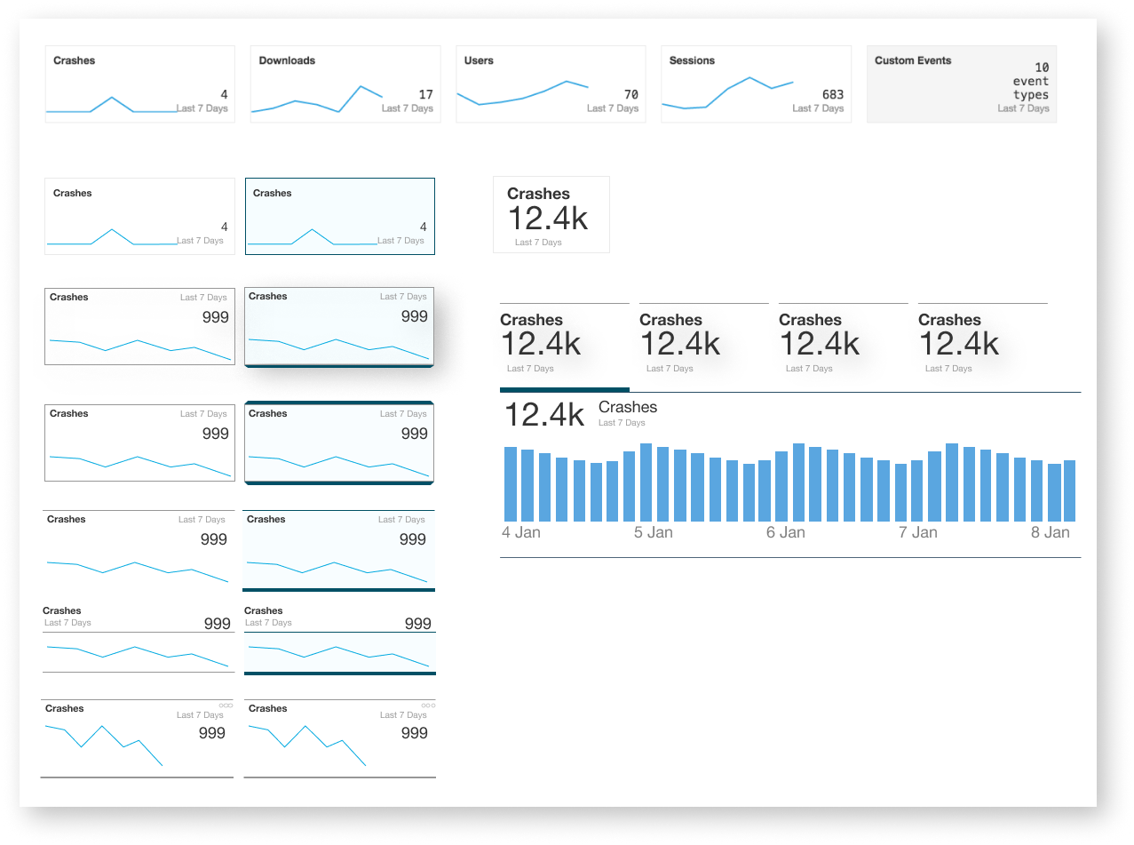
Exploring different data visualization components.
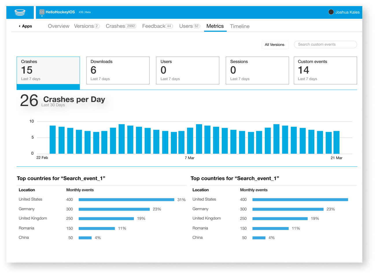
Exploring KPI’s (Key Performance Indicators) as navigation model.
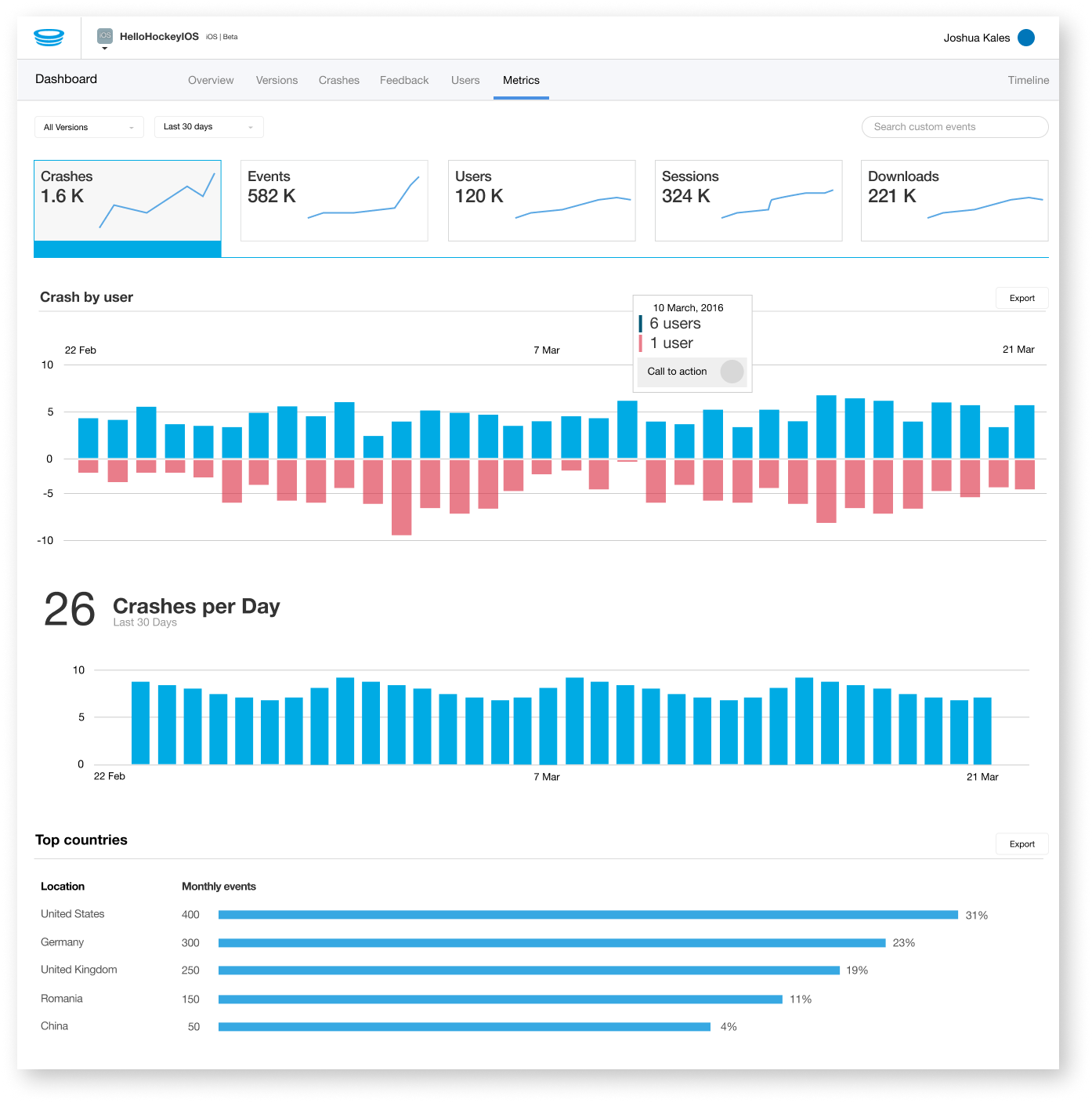
Refined further and expanded.
Research on the different methods of representing data was carried out using these books:
The Wall Street Journal guide to information graphics : the dos and don’ts of presenting data, facts, and figures / Dona M. Wong
Now you see it / Stephen Few