
Feature – Mobile Experience
My Role – UX Design – UI Design – Data Design
Problem statement
Hailing from Germany, HockeyApp was acquired by Microsoft. With new resources behind its development, we needed to help it move faster in the marketplace against Twitter Fabric and Google Firebase.
As competition started to increase, the team found themselves in a race. HockeyApp’s user base were demanding ever more competitive features to stay as customers. The decision was made to have design lay down as much work as could be done while the development team worked on other features.
Early research
Can we enable users to find their apps?
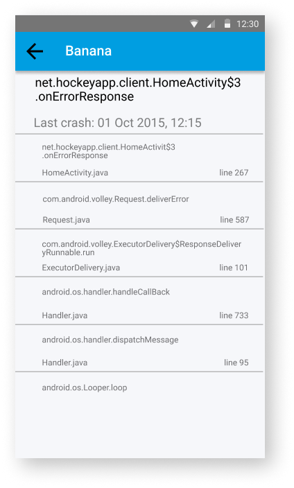
How might we get users to a crash report?
Can we empower users to act with intent?
HockeyApp had built a connection to their users through social media and public Slack channels. I used those established relationships to conduct interviews and live surveys. With smaller customers this was used to conduct online focus group sessions over video.
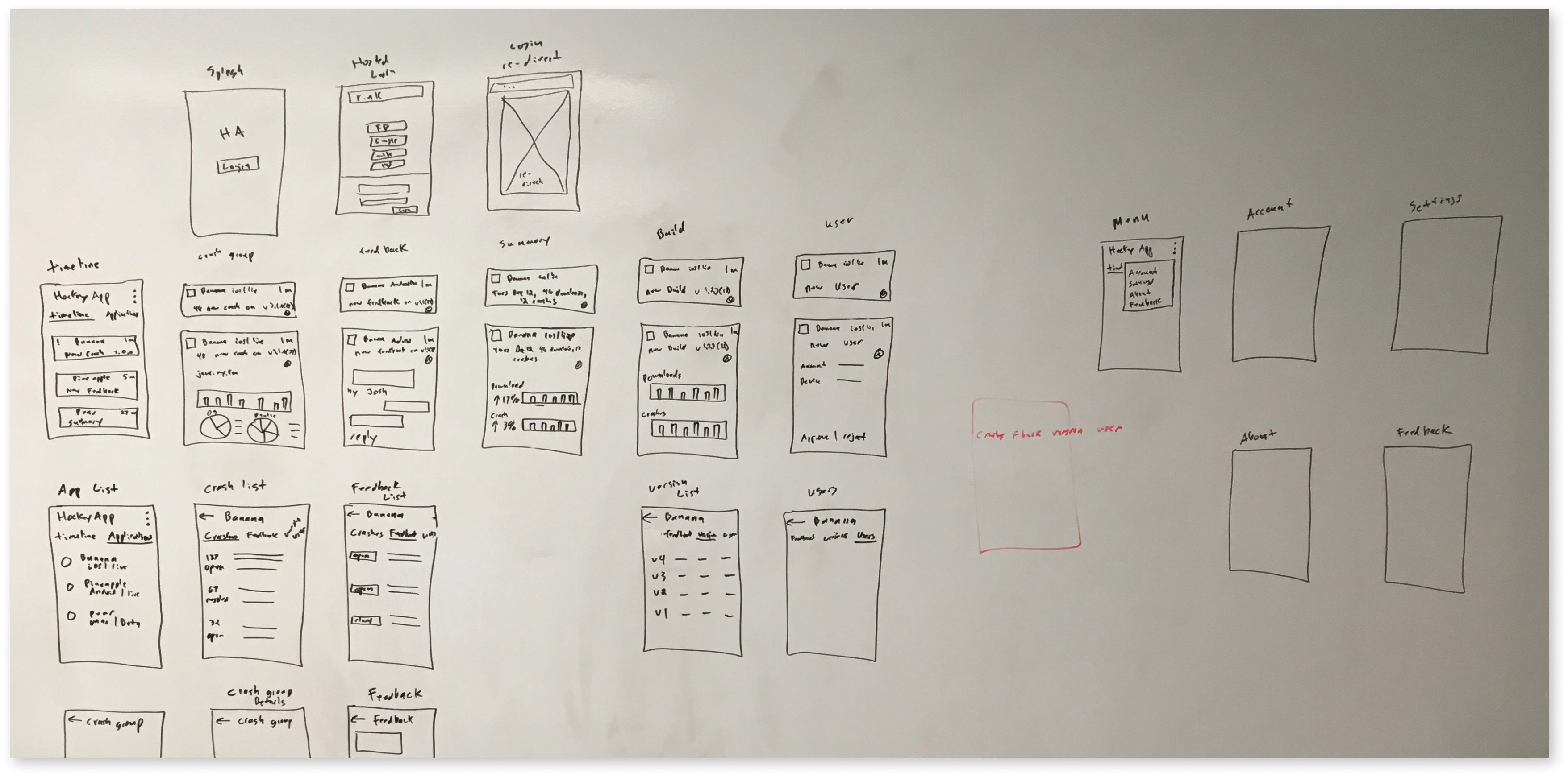
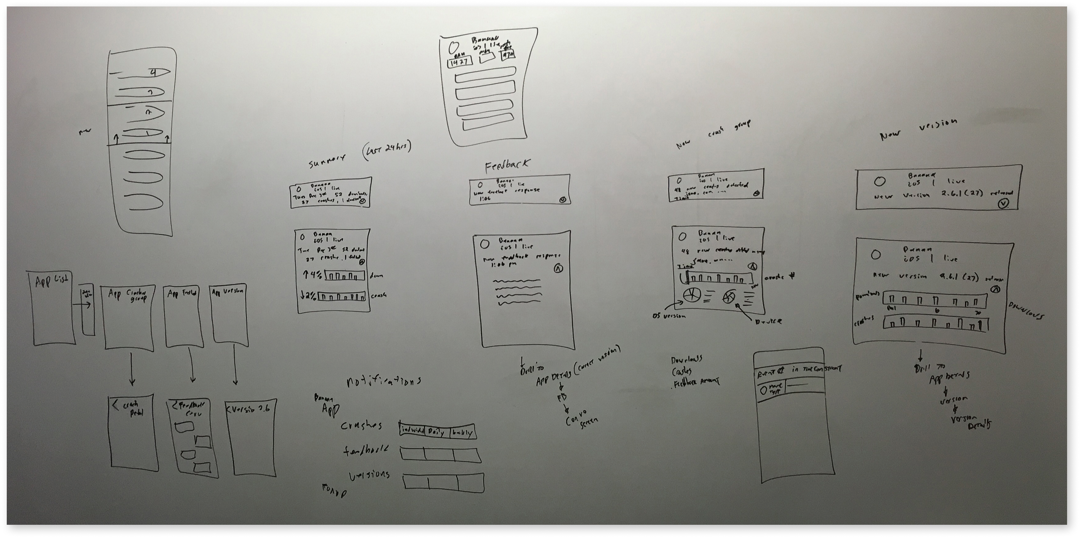
Rough wireframes and task flows
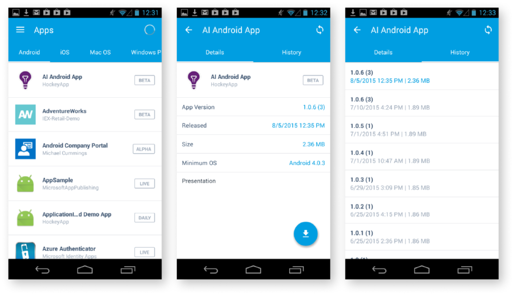
I started out talking to users to identify workflows and tasks they wanted to have in a mobile experience of HockeyApp. The product team and I began mapping out the tasks from the web into the mobile experience. We could not move the existing web experience fully into the mobile form factor and experience, I had to reduce it down to the most basic elements.
I started to mock out the mobile screens very quickly with Sketch, we wanted to make sure we had a feedback loop with users each week. Designs and task flows were vetted through Slack to user groups.
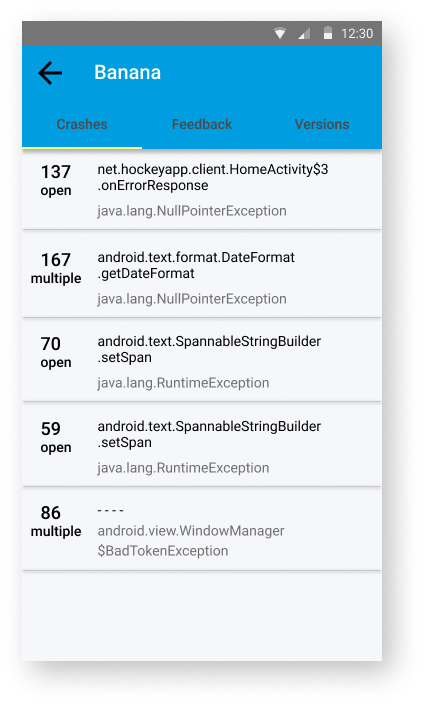
How to translate the huge amount of information coming in
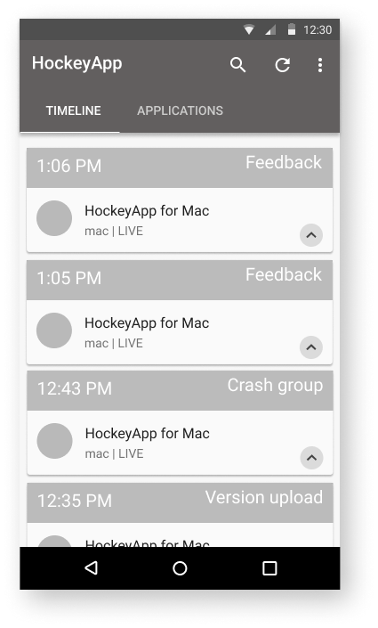
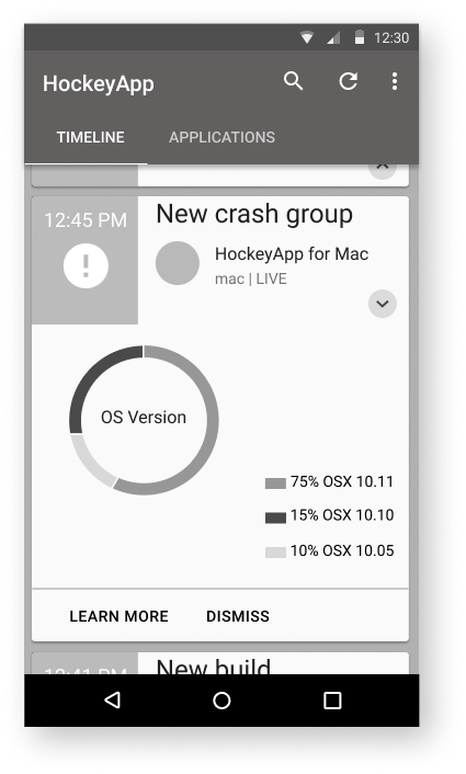
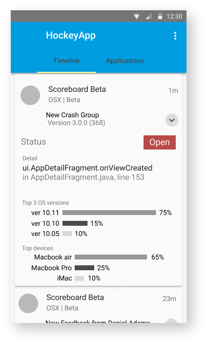
Timelines
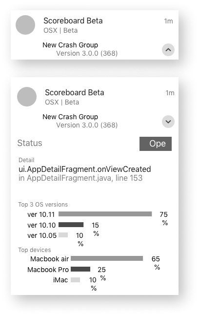
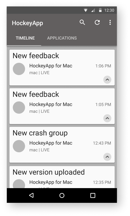
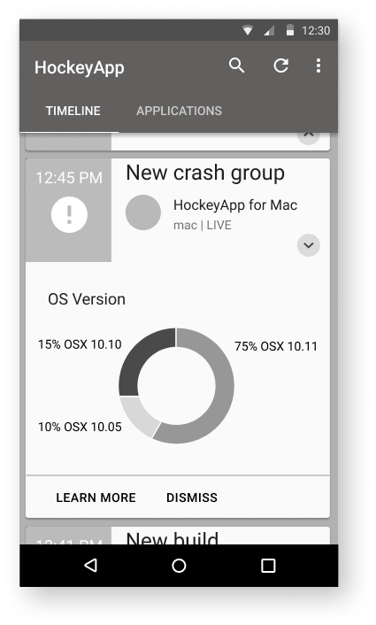
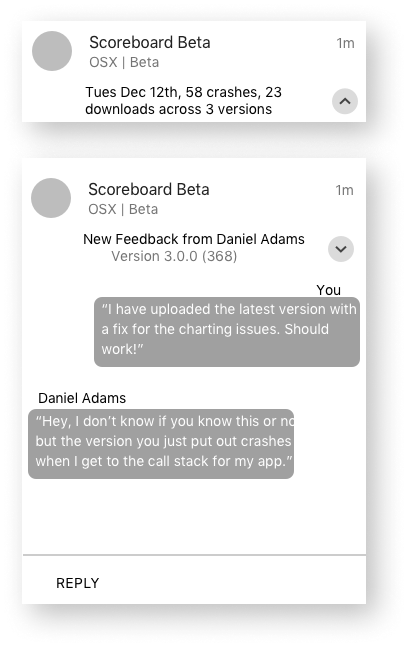
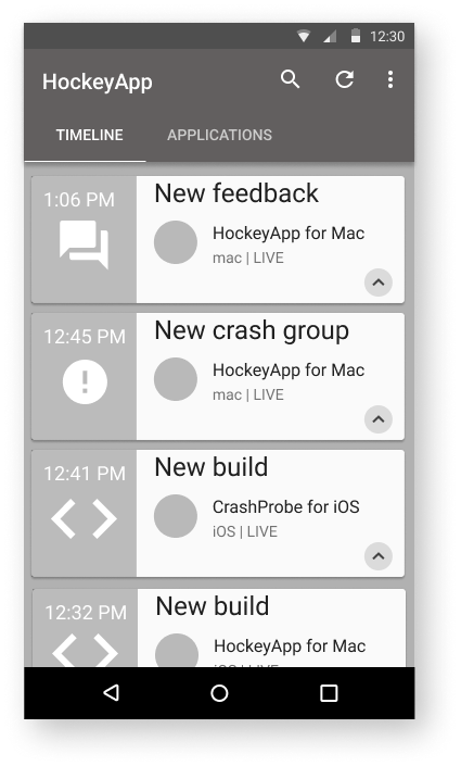
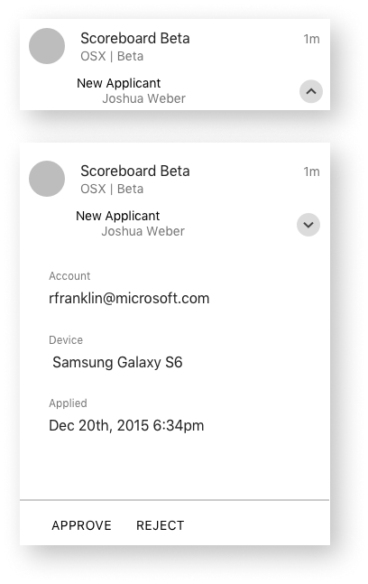
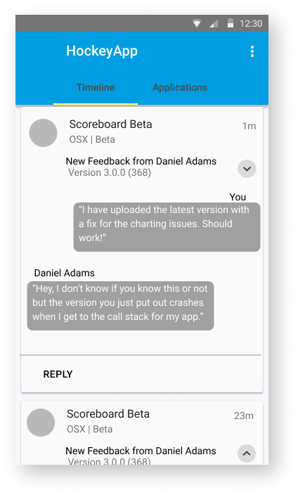
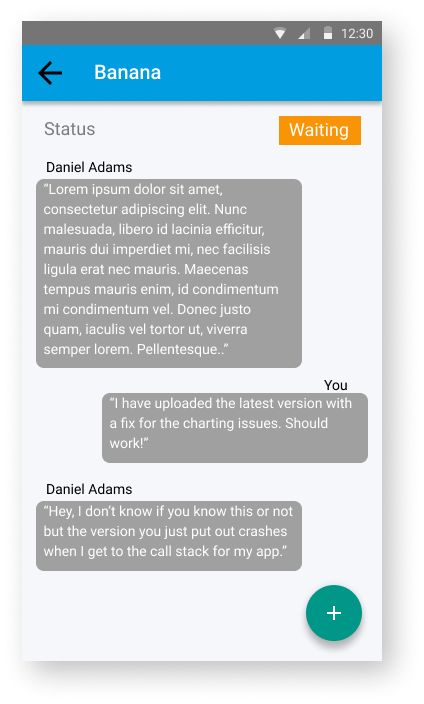
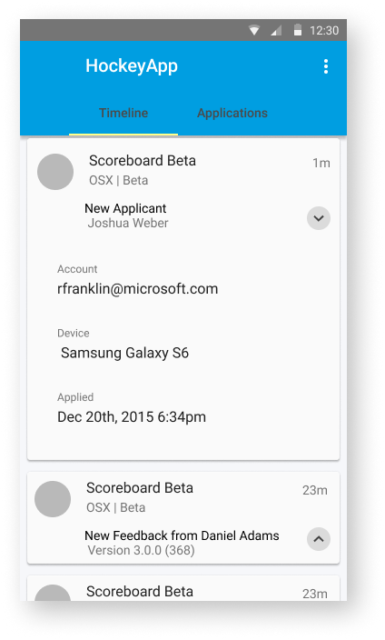
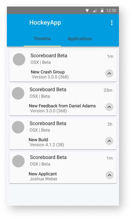
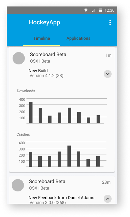
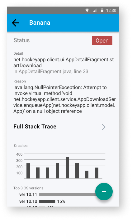
Taking inspiration from social network news feeds, A user could tap a card to be expanded in place and act on the contents as needed. This model was extensible for anything that was needed to communicate to a user.
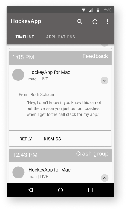
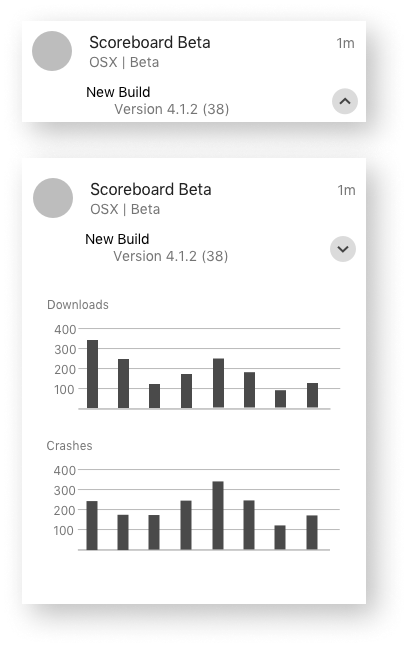
Cards
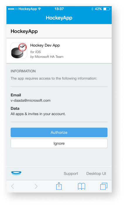
Feedback and interviews let me know that wanted discrete cards to be something you could see in a feed and click or search. I wanted to look at how social media had been giving people notifications on the web and mobile. Instead of a hub and spoke model which matched how the web application worked, we went with the card model. The Material Design card format experience would remain intact for interaction. That is that a given timeline item would expand in place.
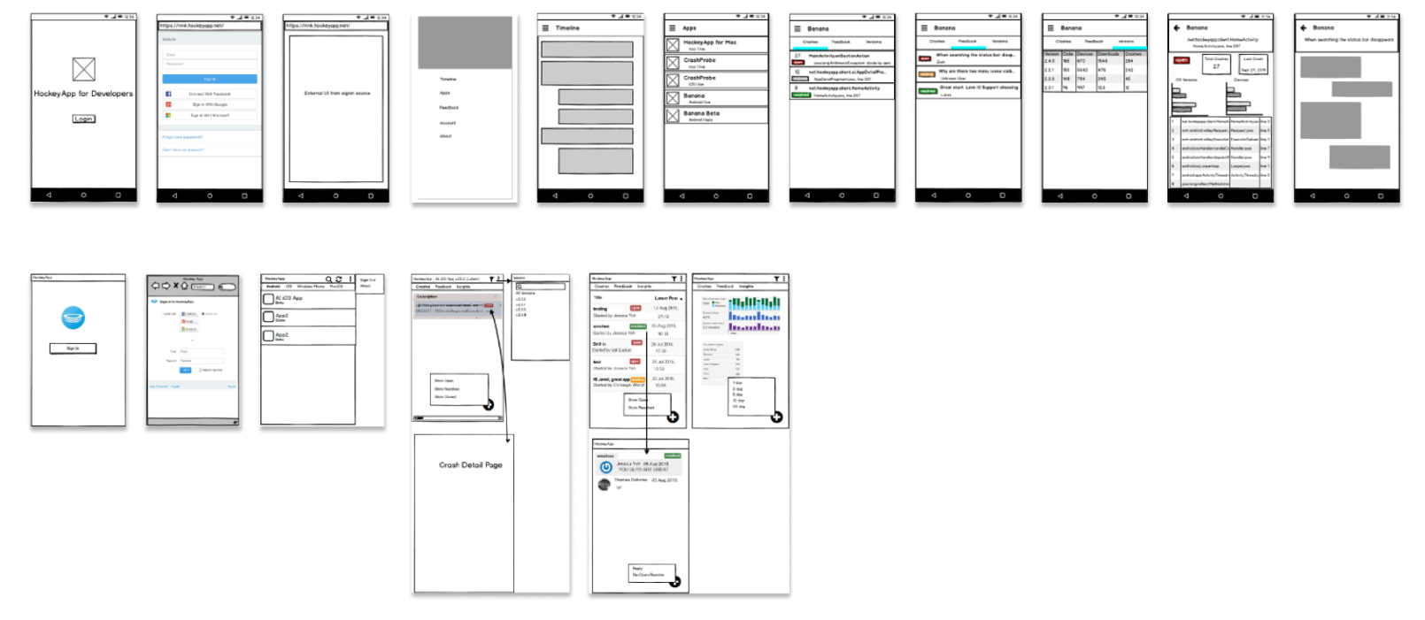
High definition and preproduction
While the development team was working on getting individual sections of the mobile application operating, I started mapping out the task flows for them. The next steps were going to be adding color and refining into high definition. As deadlines approached we had to scale back a lot of the researched work to make the MVP happen.
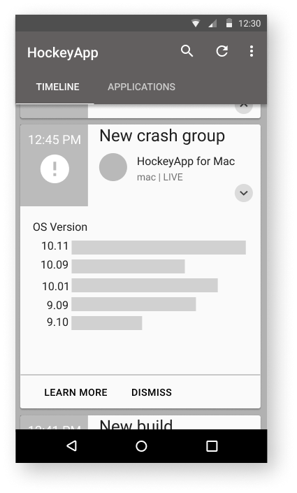
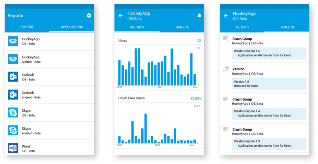
Production application screens
Next steps after production
The whole process here took three months.
Having access to a user base who is willing to give you feedback in an agile process is amazing. It requires experience to understand what is valid and invalid feedback, understanding what is an outlier can keep you from pivoting too fast or in the wrong direction. Clear communication through software like Slack, Figma, and developer tooling like Github keeps everyone on the same page. No one feels left behind or out of the loop.
The next steps were to explore what the design language of data visualization would be for HockeyApp in its web properties.