
Feature – Mobile Analytics
My Role – UX Design – Data Design
Problem statement
The Microsoft Education line of products was establishing itself as a suite of products with a grade book and other homework systems in Microsoft Teams. Interactive analytics as a feedback loop of enhancing learning was the next stage of the products offering as a serious competitor in the market. We knew we wanted to offer educators the ability to have a lightweight experience with an analytics system that could be considered situationally aware of the state of a specific class and student.
With research and interviews showing there would be a need and eventually a demand for the mobile offering, we tried to push a lot of what the main application could offer into a mobile experience.
Best intentions? It’s complicated.
We had been working on the analytics portion of the Education product line in Microsoft Teams. There were essential goals we wanted to hit for what we knew education professionals wanted to know about class performance but we already knew we would have to figure out a leaner more agile experience for mobile. That’s not what happened at first.
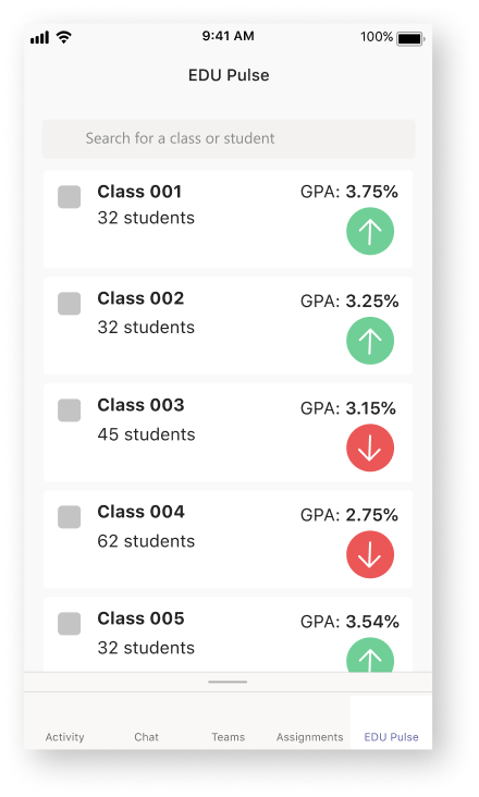
Version 001
Inspiration came from interfaces from stock trading, athletics, and sleep tracking systems.
Version 002
Refinement of the value indicators, tiles, and class selection. Added assignment screen.

Version 003
Reducing information load and adding a more tiled interface, which made things complicated.
Version 004
In which the same design elements are now just being rearranged. Tiles lose meaning and suddenly charts.


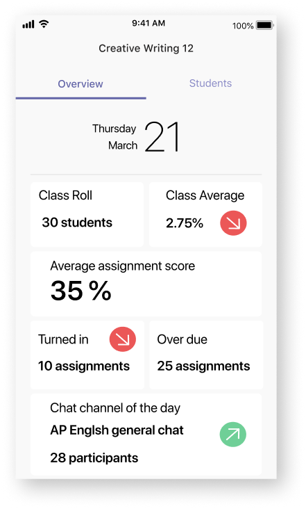
At this point, everything is starting to look the same. The tiles are getting informative but about what exactly? What will I get using those? How do I qualify the arrows and what’s my baseline anyway? Are these values for today or another day?
We had walked off into the tall grass really…
What happened next?
During an experience review it became evident we were circling the same territory without making enhancements in usability. We were circling and circling into cramming the Teams application experience into our mobile experience. To accommodate that we added more and more interfacing, more and more to touch and do, and just complicated things; we lost the flow. We restarted by revisiting research, resetting core principles, and looked at what we thought we knew but really misunderstood.
Version 005
Setting the core principles for understanding classes and students, divergence.
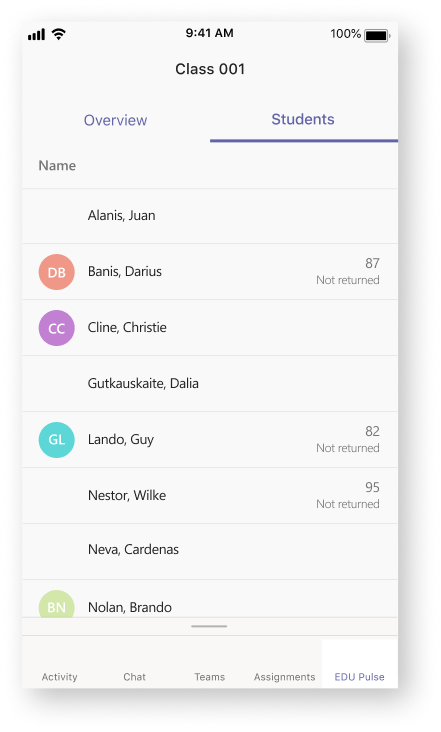
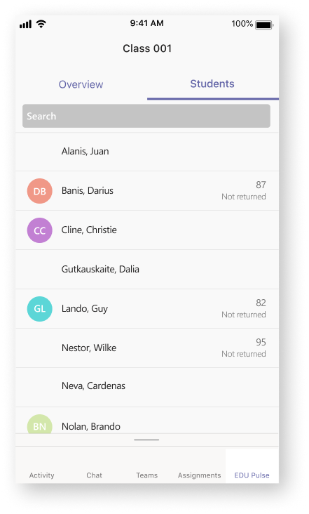
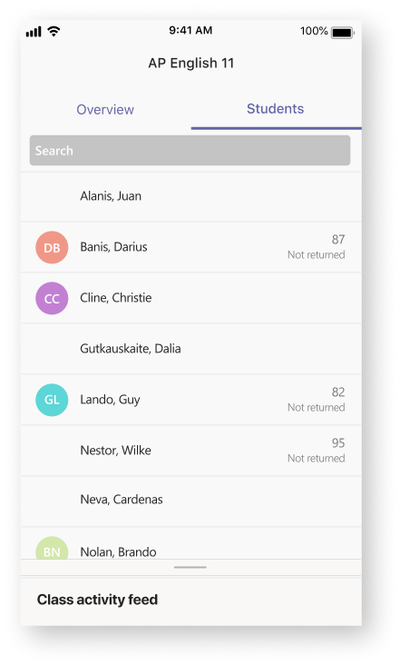
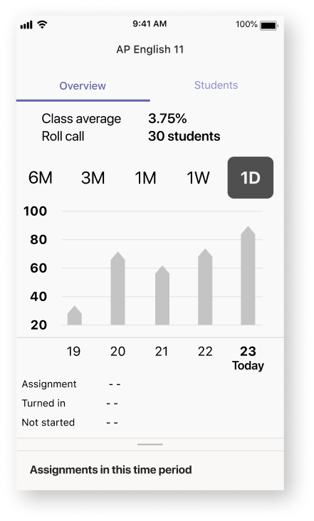
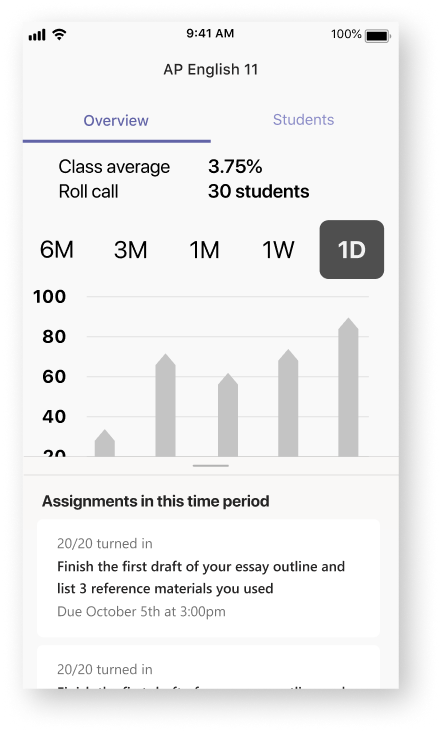
Average Grade across assignments
“As a teacher, I want to know the average assignment score and recent fluctuations to better understand the performance of my class.”
Teams Conversation Usage Percentage
“I want to know the total count of posts, replies and likes to better understand the conversation and collaboration in my class.”
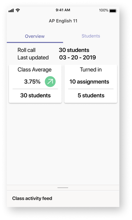
Assignment On Time Percentage
“As a teacher, I want to know the percentage of on-time assignments for the class to understand the work and study habits of my class.”
Average Number of hours to return an assignment
“I want to know the average time it takes me to return an assignment to the class I can improve the feedback loop.”
Attempting simple is not easy
While we had these core principles to work with, we wanted to ensure that we were going to keep this simple. We kept to simple design guidelines:
– What am I inspiring you to know?
– What am I enabling you to do?
– What action can you take?
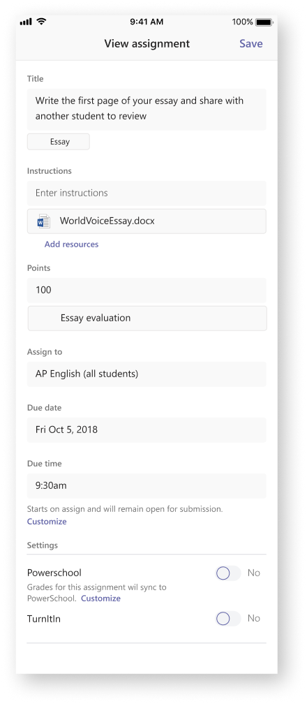
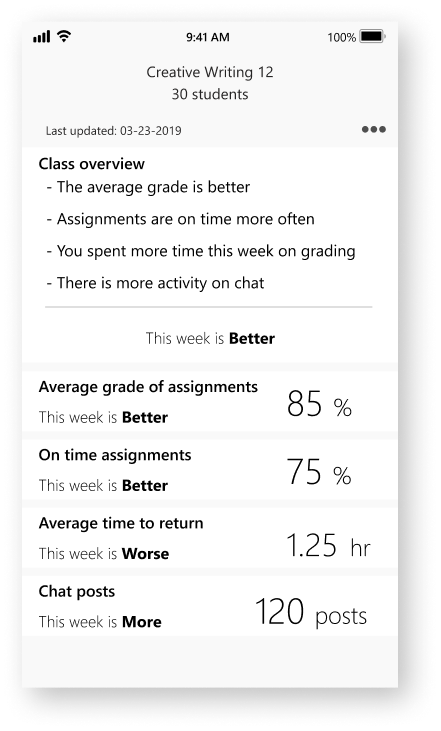
Starting off with providing a breakdown of the data. While accurate, this was too much to deal with on a mobile device.
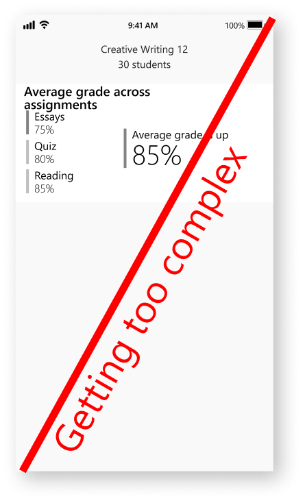
As soon as a design became too complicated or time consuming to design, it was ended.
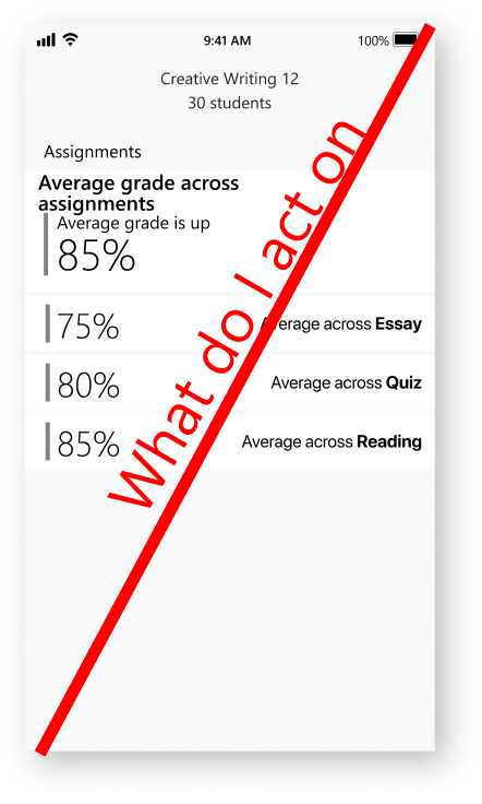
While this was heading towards accurate and easy to use, the percentages were confusing.
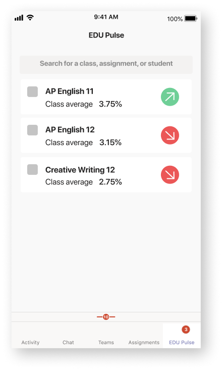
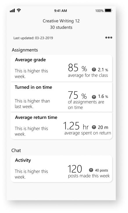
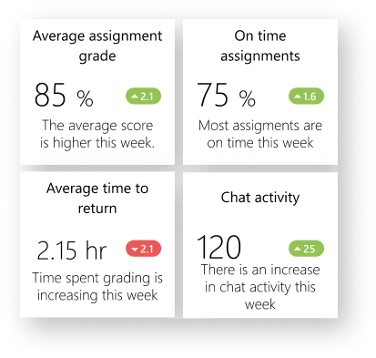
The overview, situational feedback of the current week, and little hints as to how the data is performing gives a bit of a push into exploring.
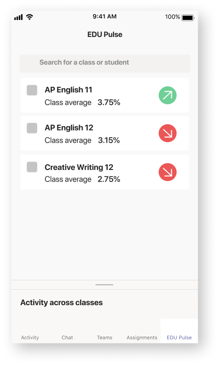
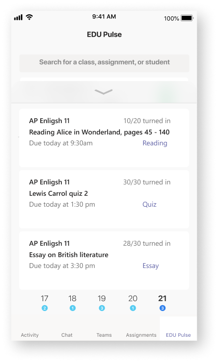
Version 007
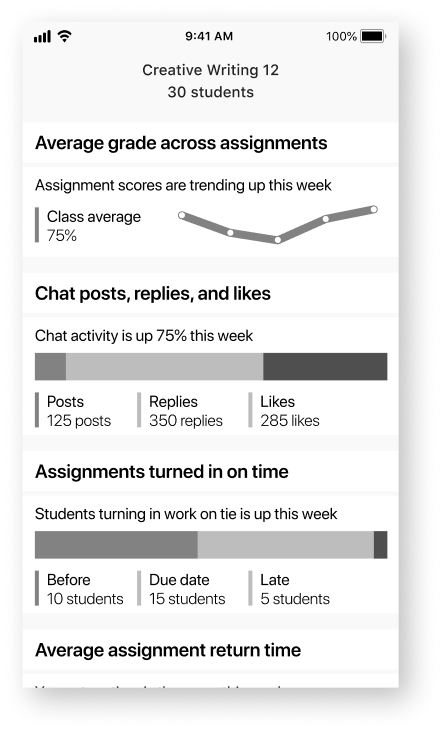
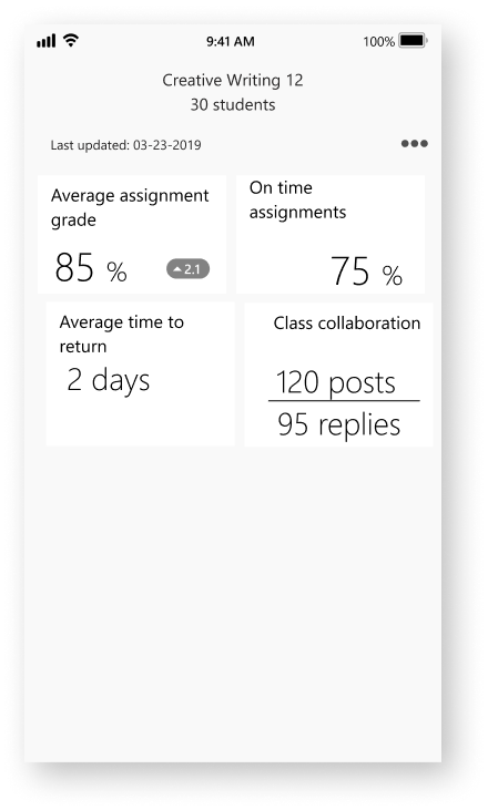
Converging back to tiles but with purpose.
Version 008
Dropping into data quickly. The principles are clear and concise.
Each tile is a principle, simply touch to explore.
Assignment average.
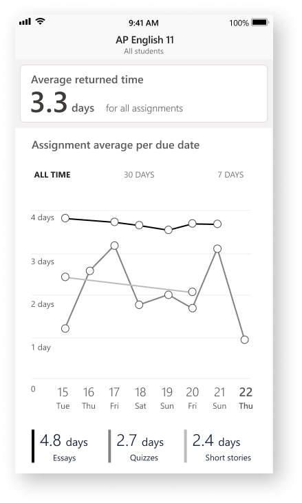
Average returned time.
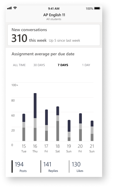
Conversation usage.
What did I learn from this?
Desktop first can work but there is a trending toward maximal interfaces over minimalism. Mobile first as a design philosophy forces you to get rid of the experiences that are not necessary. If the experience is fulfilling enough and can move the user through to accomplishing their tasks, then the desktop version of the software is a natural extension of the mobile experience.
While not the first enterprise mobile application I had designed, this was the first time I had done mobile first. The challenge of stripping away what wasn’t needed was a massive growing experience for me in the way I looked at other enterprise products from then on. Content first, simplicity of action, and contextually only that which is necessary are the three driving factors behind my design today.